
Caption: The statistics for confirmed exoplanets (which we usually just call planets since that is what they are) given in the graphs are from the EPE Diagrams page of The Extrasolar Planets Encyclopaedia (EPE). The statistics were current circa 2021 Jul10 and are mostly from discoveries by Kepler spacecraft (main mission 2009--2013, K2 mission 2013--2018).
However, TESS (Transiting Exoplanet Survey Satellite, 2018--) is actively discovering exoplanets, and so there will be thousands more confirmed exoplanets in a few years if NOT sooner.
As of circa 2021 Jul10 there 3540 confirmed planetary systems and 4785 confirmed exoplanets (see The Extrasolar Planets Encyclopaedia: Catalog).
Note EPE used to allow inline linking to their graphs, but they have eliminated that useful feature, and so yearly downloadeds of updated graphs are now needed.
Graphs (i.e., Plots):
- Graph 1: Year of discovery versus mean orbital radius (semi-major axis):
This semi-log plot was obtained from EPE: Diagrams: y-axis: year of discovery versus x-axis: log semi-major axis (i.e., mean planet orbital radius).
Features:
- The plotted range ∼ 10**(-3) to 10**4 AU of
mean orbital radius
spans of all confirmed
exoplanets.
Recall astronomical unit (AU) = 1.49597870700*10**11 m.
- The 1988
discovery NOT
on Graph 1 is
Gamma Cephei Ab.
This discovery
was tentative and only confirmed in
2002.
It is usually NOT regarded as the first
discovery of
an exoplanet.
- The 1992
discoveries
on Graph 1
are the pesky pulsar planets
in the planetary system
of millisecond pulsar
PSR B1257+12.
These pulsar planets are
are PSR B1257+12 A (AKA Draugr),
PSR B1257+12 B (AKA Poltergeist),
and PSR B1257+12 C (AKA Phobetor).
Emphasis: These are NOT ordinary planets orbiting ordinary stars. They pulsar planets orbiting a pulsar: i.e., a radio pulsating neutron star.
- The first discovery
of an ordinary planet
orbiting an ordinary
star
was
51 Pegasi b (discovered 1995)
orbiting
51 Pegasi.
It has mean orbital radius
(semi-major axis) 0.0527(30) AU
and on Graph 1 it is the dot in the
1995 row at the
left.

- Graph 2: Host star mass versus planet mean orbital radius (semi-major axis):
This is a log-log plot.
Note that the stellar masses are clustered around 1 solar mass (M_☉).
Remember that we are looking for life as we know it, and so there is a preference for observing stars that are like the Sun, and so have about 1 M_☉.
The preference may be wearing off at least in the direction of lower mass stars since it is now known that they usually do have lots of planetary systems (e.g., Dressing & Charboneau 2013) some which might be habitable.
In the direction of higher mass stars the observational preference is probably still there.
Recall the trends for main sequence stars from the Main-sequence rule:
  M ↑, R ↑, L ↑, T_photosphere ↑  t_lifetime ↓  f ↓

    which means that as stellar mass M increases,
    stellar radius R increases,
    luminosity L increases,
    photospheric temperature increases,
    main-sequence lifetime decreases,
    and frequency f (see Wikipedia:  Initial mass function) decreases.
So the more massive the star, the shorter its lifetime on the main sequence and the less time life as we know it has to evolve.
So our hypothesis is that larger the mass, the less likely there is to be life as we know it.
Also going to larger stars increases the same biases against discovery as going to smaller planets for the same reasons mutatis mutandis.
The upshot is that we don't look at more massive stars too much in the search for planetary systems.
Note that stars more massive than about 8 solar masses (i.e., 8 M_☉) live only a few million years on the main sequence and explode as core-collapse supernovae---which is highly inimical for life as we know it.
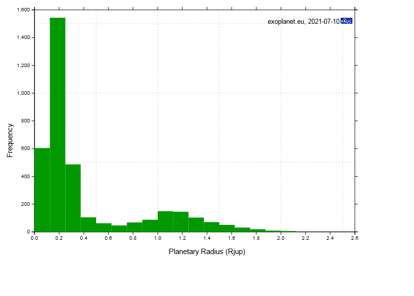
- Graph 3: Histogram of raw counts versus planet radius:
There is a bimodal distribution (i.e., one with Twin Peaks).
This observed distribution is probably very unrepresentative the real distribution.
Remember the two main methods of detecting exoplanets have a bias toward finding larger exoplanets. Doppler spectroscopy is biased toward more massive exoplanets and the transit method toward larger-radius exoplanets. The two biases are NOT the same, but they are strongly correlated: mass and radius tend to increase together. But there are other factors. For example, a more massive planet can have smaller radius than less massive planet if it is sufficiently colder or made of sufficiently denser materials.
The bias to larger larger exoplanets partially explains the peak centered at about 1.2 Jupiter radii.
Why there is another peak centered at about 0.2 Jupiter radii, yours truly doesn't know. Probably some observational bias.
In the near future, the distribution will probably look quite different as thousands of candidate planets are added to the plot.
Yours truly suspects the emerging new observed distribution that is better representative of the real distribution will have only one peak.
One distribution corrected for bias is roughly flat from about 0.1 Jupiter radii to 0.25 Jupiter radii, then declines sharply to about 0.35 Jupiter radii and then declines more slowly (see Howard 2013, p. 5).
But this corrected distribution is far from being the last word.
- Graph 4: Orbital period versus planet mean orbital radius:
See below for this is a log-log plot.
The fact that most points lie nearly on a straight line agrees with Kepler's 3rd law which has the formula
  P=[2π/(GM)**(1/2)]*R**(3/2)  ,

      where P is orbital period,
            M is the host star (assumed much larger than the
               planet mass),
            G is the gravitational constant,
            and
            R is the mean orbital radius
              (AKA the semi-major axis).

  On a log-log plot, one gets
     the linear relationship between logarithmic period and logarithmic radius

  log(P)=(3/2)*log(R) + constant.
The shown plot is a band, NOT a line, because the host star mass varies and because of gravitational perturbations in non-two-body systems.


- Graph 5: Planetary mass versus planet mean orbital radius:
This is a log-log plot.
The bias toward finding larger mass planets close to host stars (i.e., with about 1 AU) is evident.
Other explication will have to wait until yours truly knows more.

- Graph 6: Planetary radius versus planet mean orbital radius (semi-major axis):
This is a log-log plot.
The bias toward finding larger radii planets close to host stars (i.e., with about 1 AU) is evident.
Other explication will have to wait until yours truly knows more.
- The plotted range ∼ 10**(-3) to 10**4 AU of
mean orbital radius
spans of all confirmed
exoplanets.
Download site: EPE: Diagrams: scatter plot.
-
Images (i.e., Graphs, Plots):
- Image link: EPE: Diagrams: scatter plot:
Image link direct
Itself.
- Same.
- Same.
- Same.
- Same.
- Same.
File: Planetary systems file: planet_statistics.html.