
Image 1 Caption: The up-to-date Keeling curve (atmospheric carbon dioxide (CO_2) abundance versus time graph) since inception in 1958 circa Mar15 (Daniel C. Harris 2010, Anal. Chem. 2010, 82, 7865--7870, "Charles David Keeling and the Story of Atmospheric CO_2 Measurements", Fig. 2). from Mauna Loa Observatory, Mauna Loa, Hawaii Island (the Big Island), Hawaii.
Image 2 Caption: The same for the last 5 years.
The red curve is the monthly-average curve and the black curve is a running average curve (see detailed explanation below).
Features:
- Hawaii is far from industrial areas,
and so the air
at the high altitude 3.397 km of the
Mauna Loa Observatory
is believed to be close to the average of well mixed
air for the
whole Earth.
Hence the Keeling curve from
Mauna Loa
is considered the fiducial one for the Earth.
One can also say that the Keeling curve from Mauna Loa is one for an average location on Earth rather than an average of Keeling curves for many locations on Earth.
So it is a Earth average Keeling curve in special sense of the word average.
- The top graph
begins in 1958
circa Mar15
when CO_2 measurements began
at Mauna Loa.
The bottom graph is the recent CO_2 measurements.
- In 1958,
the CO_2 abundance was 315 ppm
(see Wikipedia:
Keeling curve).
As of late 2024, it is ∼ 425 ppm.
Prior to the beginning of the Industrial Revolution (c.1760--c.1840), the CO_2 abundance was ∼ 280 ppm. Since the about the beginning of the Holocene (∼ 11,700 BP--present) and the Neolithic (c.12,000--c.4000 BP, c.10,000--c.2000 BCE), the CO_2 has been in the range ∼ 260--280 ppm (see Wikipedia: Carbon dioxide in Earth's atmosphere: Concentrations in the geologic past).
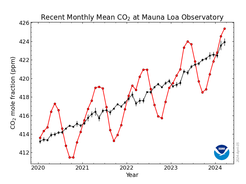
- As exhibited by the monthly-average curve
in both Image 1 and Image 2,
there is an seasonal cycle of
CO_2 abundance
with a peak-to-trough variation of ∼ 6 ppm superimposed on the long-term trend.
The maximum is typically near
May01
and the minimum is typically near
Sep15.
September
(see Wikimedia Commons:
File:Mauna Loa CO2 monthly mean concentration.svg;
Wikipedia: Carbon dioxide in Earth's atmosphere: Annual and regional fluctuations).
-
The peak-to-trough variation in the
plots
looks more like ∼ 8 ppm, but this is
because it is superimposed on a rising trend of 2 to 3 ppm per
year
(see
Wikipedia: Carbon dioxide in Earth's atmosphere: Annual and regional fluctuations).
The Northern Hemisphere seasons dominate the seasonal cycle because it has more land mass than the Southern Hemisphere (see Wikipedia: Carbon dioxide in Earth's atmosphere: Annual and regional fluctuations).
- To explain in detail the monthly-average curve and
running-average
curve, we
quote from NOAA: Trends in Atmospheric Carbon Dioxide:
-
"In the graphs,
the red
dashed line
with circle symbols
(only in Image 2) represents the monthly mean values,
centered on the middle of each month.
The black
solid line with
square symbols
(only in Image 2) represents the same
after correction for the average seasonal cycle. The latter is determined as a
running average (AKA moving or rolling average)
of 7 adjacent seasonal cycles centered on the
month to be corrected,
except for the first and last 3.5
years of the record, where the seasonal cycle
has been averaged over, respectively, the first and last
years." (Somewhat edited.)
- As you can see, running average
curve breached
400
ppm
in 2015
March.
There is nothing fundamental about
400
ppm.
It's just a value like 398 ppm and 399 ppm.
But it is a psychological threshold to cross
400
ppm.
The running average curve will probably NOT fall below 400 ppm again for centuries.
The monthly-average curve did NOT fall below 400 ppm in 2016 September when it minimized: 401 ppm was the minimum. So probably both the monthly-average curve and the running average curve will NOT fall below 400 ppm again for centuries.
- The running average
curve
has been nearly linear since ∼ year
2010.
Since 2010, the slope has been ∼ 2.5 ppm/year.
If this linear growth continues, CO_2 will reach 450 ppm in ∼ year 2034.
International discussion often cites stabilization at 450 ppm as a goal. Climate modeling suggests that stabilization at 450 ppm will keep global warming at under or about 2° C over the ∼ year 1880 global average temperature which is also a discussed international goal (see Wikipedia: United Nations Framework Convention on Climate Change).
Yours truly finds it hard to believe we will stabilize at 450 ppm, but we might be able to delay it beyond 2034.
If the linear growth in CO_2 continues longer, CO_2 will reach 560 ppm (about twice the pre-industrial abundance of ∼ 280 ppm) in ∼ year 2078. It has been estimated that 560 ppm would lead to ∼ 3° C increase over year 1880.
It should be noted that climate modeling predictions have large uncertainties.
By the by, if CO_2 reaches 560 ppm, we all become werewolves---but don't let anyone know.
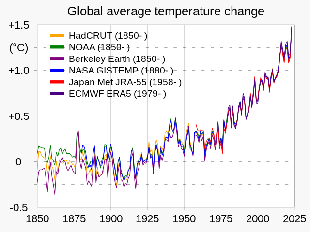
- Image 3 Caption: A graph of
temperature anomaly
as determined by several scientific organizations:
HadCRUT,
NOAA,
Berkeley Earth,
NASA GISTEMP,
Japan Meteorological Agency,
European Centre
for Medium-Range Weather Forecasts.
- The fiducial global temperature
is generally considered to be the average
global temperature of 14° C
for the period
1961--1990
(see Wikipedia:
Instrumental temperature record: Absolute temperatures v. anomalies).
However, ∼13.3° is considered the fiducial global temperature for pre-industrial global temperature and is approximately the average global temperature for 1850--1900.
The Industrial Revolution (c.1760--c.1840) was earlier than 1850--1900, but the burning of fossil fuel had NOT yet started causing significant global warming by 1850--1900.
- The pre-industrial fiducial
global temperature
∼13.3°
is the zero level
on the graph
in Image 3.
The vertical
axis is
the temperature anomaly:
difference between average global temperature
and ∼13.3°.
- Smoothing the
curve in the
graph since
1975 into
straight line
gives a rate of
temperature anomaly increase
of ∼ 0.5/25 = 0.02 degrees/year.
Using this rate and temperature anomaly 0.8°C for the year 2000, we find we reach temperature anomalies 1.5°C, 2°C, and 3°C in, respectively, years 2035, 2060, and 2110.
For the later years, the above results are very uncertain extrapolations. However, reaching temperature anomaly 1.5°C by ∼ 2035 seems very likely.
The Paris Agreement (2015) set temperature anomaly 1.5°C as the preferable upper limit on temperature anomaly. Alas, it seems this upper limit will be breached.
However, keeping the temperature anomaly less than 2°C may be achievable.
- Note that if the Earth
were a perfect blackbody radiator, its
surface temperature would be
∼ 5° C.
If the Earth
were a perfect blackbody radiator
except that it has its actual albedo (diffuse reflectivity)
of ∼ 0.7, its temperature would be
∼ -19° C
(see
Earth file:
temperature_effective.html;
Wikipedia: Greenhouse effect).
The greenhouse effect raises the average global temperature above these hypothetical chilly values ∼14.5°C (i.e., 13.3+1.25 from Image 3). So the greenhouse effect is good, in fact. But as global warming shows, you can have too much of a good thing.

-
Images:
- Credit/Permission:
National Oceanic and Atmospheric Administration (NOAA),
2050 eventually /
Public domain.
Image link: NOAA: Trends in Atmospheric Carbon Dioxide.
- Credit/Permission:
National Oceanic and Atmospheric Administration (NOAA),
2050 eventually /
Public domain.
Image link: NOAA: Trends in Atmospheric Carbon Dioxide.
- Credit/Permission: ©
User:RCraig09,
2023 /
CC BY-SA 4.0.
Image link: Wikimedia Commons:.
File: Earth atmosphere file: keeling_curve.html.