
Credit: NASA.
Papers
These are just papers I've read and found useful. They are given in reverse time order.
Images
Some of the links below are broken. Those images I feel doubtful about posting since the permission or public domain status is unclear. The thumbnail images are linked to larger images where more information and full credit are given if necessary.
 The Round Earth Theory
An early sketch by Parmenides of Elea (early 5th century BC) of his round Earth model. Now if you believe that I have this bridge . . .
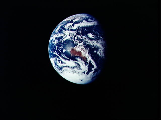
 The Earth from Apollo 17, 1972dec07.
One of the few images showing a full Earth. Blue oceans, anticyclones, To the south Antarctica and Madagascar. At the northern edge: India, Asia, Europe. Greece, Israel, Arabia, Egypt. Somewhere near the center is Oldavai Gorge.
Credit: NASA: Image #EL-1996-00155 .
 Earth from Apollo 17, 1972dec07.
Credit: NASA.
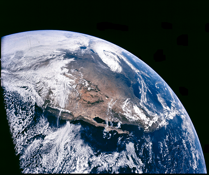 North America from Apollo 16, 1972 April 16.
You can see the Baja Peninsula (which is about 1200 km long), the Rocky Mountains, and, towards the top, Lakes Superior and Michigan.
Credit: NASA: Image #AS16-118-18873.
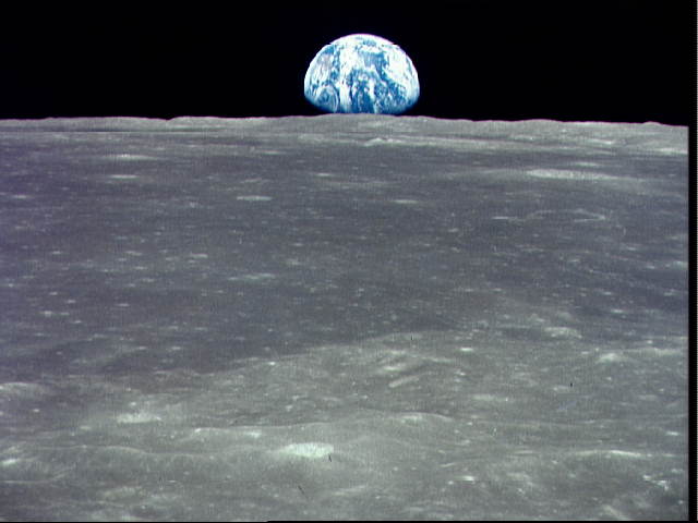 Earthrise from Apollo 11, 1969jul16.
A picture which
never gets tired: "It is time for you to return to Earth"
( Andrei Tarkovsky's
Solaris ).
Credit: NASA: Image #AS11-44-6549 .
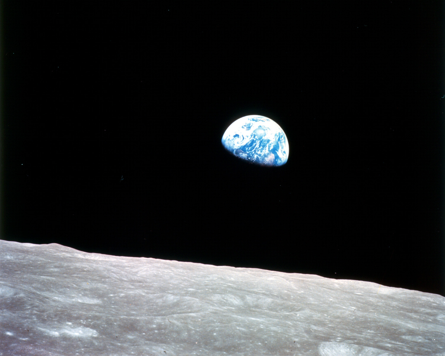 Earthrise from Apollo 8, 1968dec29.
Credit: NASA: Image #AS17-148-22742.
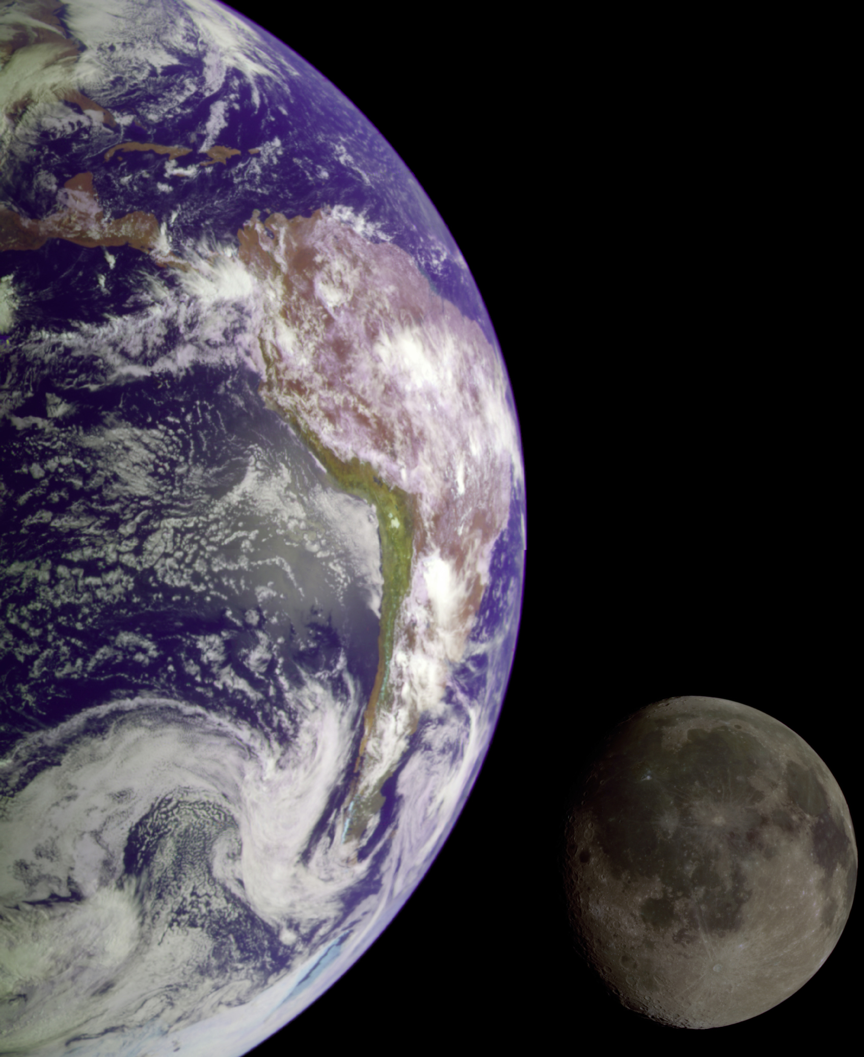 Earth and Moon from Galileo probe, 1990jan02.
Credit: NASA.
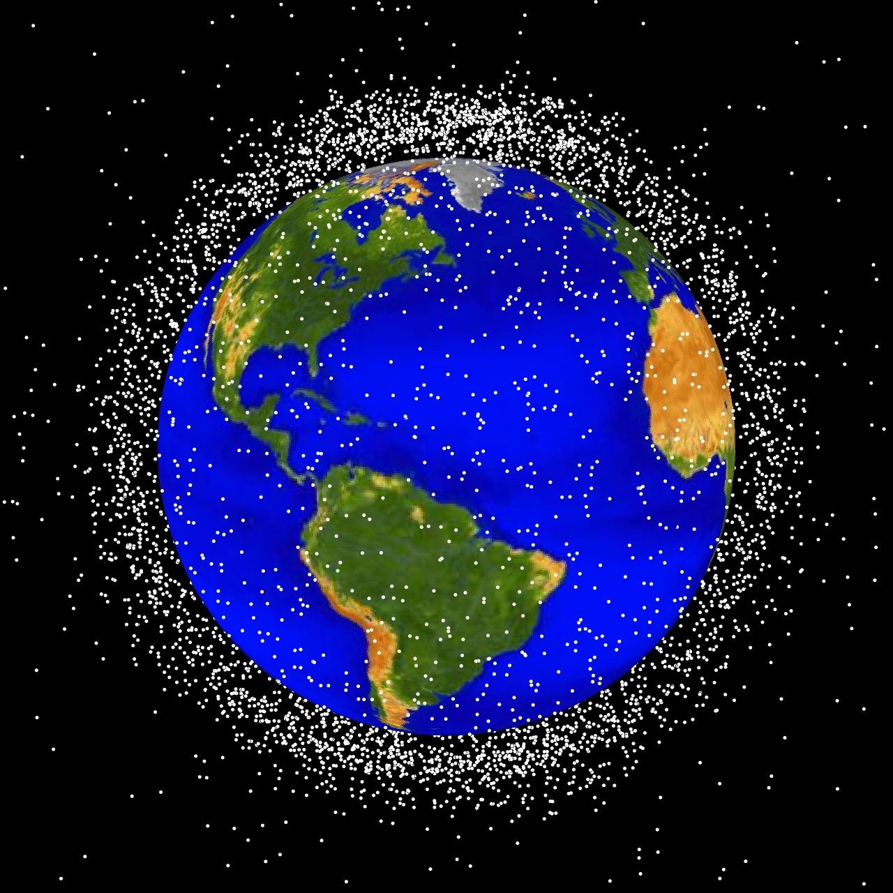 Space debris in low-Earth orbit.
All kinds of orbits have been used for satellites and spacecraft and so you can find junk in almost any orbital vicinity.
Also collisions between space debris can send the fragments off into random orbits.
 Cartoon of the Earth's magnetic field.
 Political World Map, year 2000.
Credit: Central Intelligence Agency (CIA); download site Perry-Casta~neda Library Map Collection University of Texas Austin. Most of the maps are in the public domain and can be downloaded. There are historical maps.
 A small political map of Mexico
The Chicxulub crater straddles the northern coast of the Yucatan Peninsula with center just east?? of Progreso. It is centered near the village of Chicxulub. (Chicxulub is pronounced chick-shoe-lube I believe.)
The Chicxulub crater is 170 km in diameter and is the 3rd largest crater known on Earth. But it is entirely covered by sediments.
It was discovered by finding shock-exposed rock and subsequent geological investigation.
The Chicxulub impactor hit about 65 million years ago and probably the caused a mass extinction at the end of the Cretaceous period that included the extinction of the dinosaurs.
The impactor probably threw ejecta up in plume that may have fallen back all over the Earth.
The impactor and ejecta may have touched off world-wide firestorms??? and caused dust in that atmosphere that a multi-year winter (Se-574).
Credit: Central Intelligence Agency (CIA); download site Perry-Casta~neda Library Map Collection University of Texas Austin. Most of the maps are in the public domain and can be downloaded. There are historical maps.
You may have thought the CIA were spys, but actually they make maps---I think, explains a great deal.
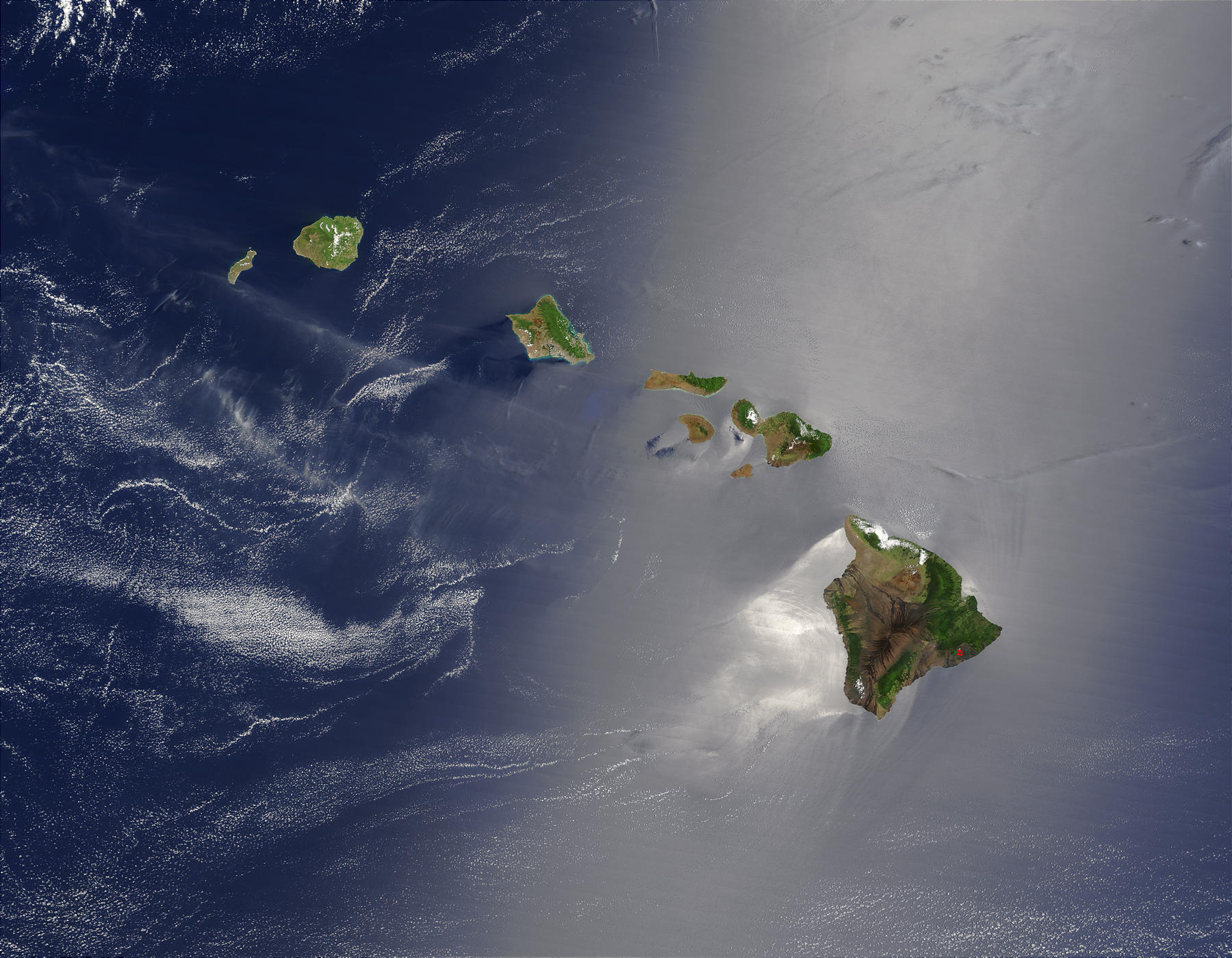 Hawaiian Islands from the Terra Satelitte. True color.
The Big Island (Hawaii Island) is obvious. Oahu (with Honolulu with Pearl Harbor) is the 3rd island from the left.
Credit: NASA: Visible Earth.
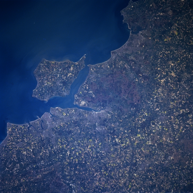
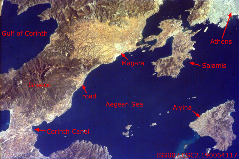 Greece: The Corinthian Peninsula and Saronic Gulf.
Credit: NASA: ISS EarthKam.
 Continental Shelf off Los Angeles
Credit: NASA: Visible Earth.
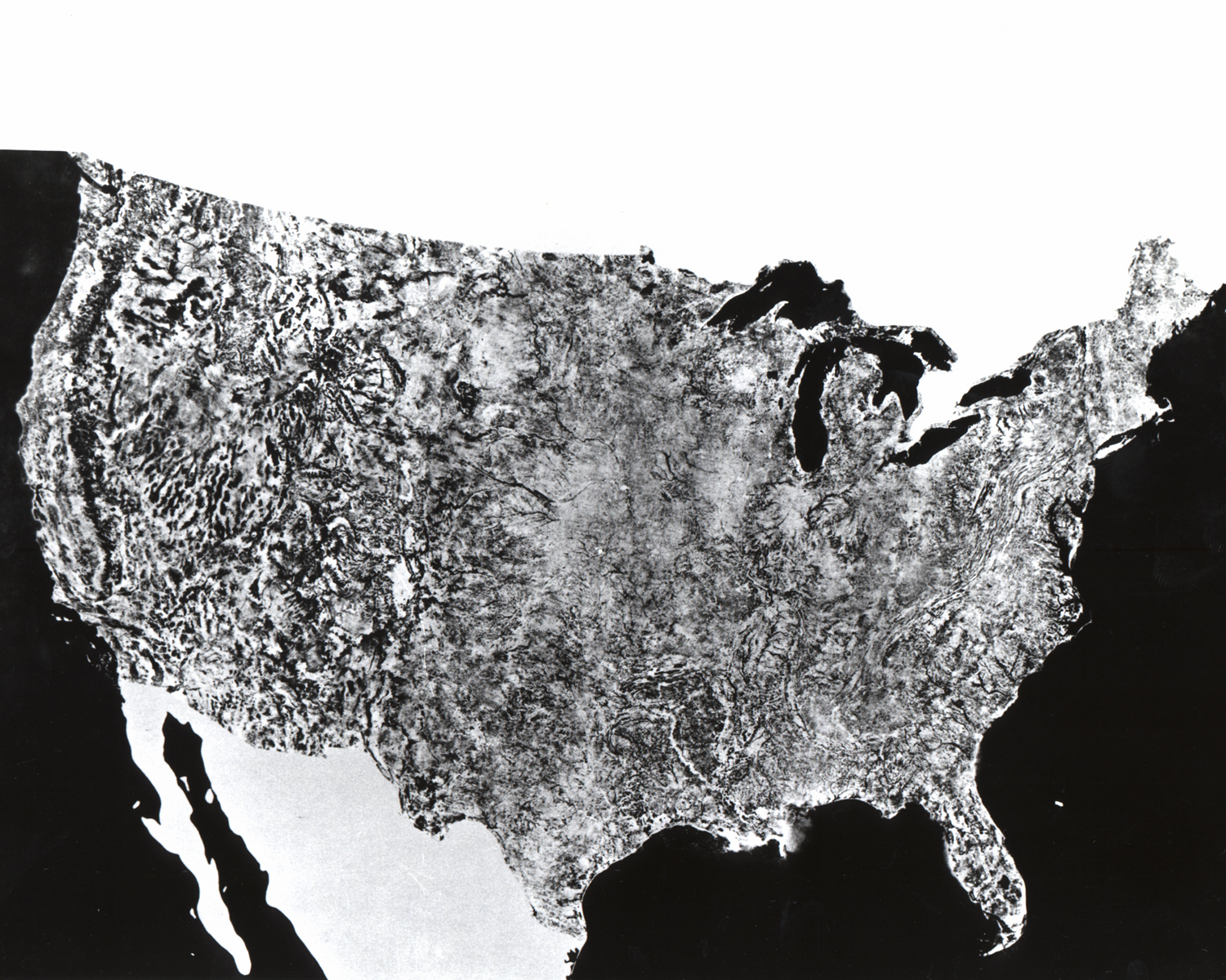 Mosaic photo map of USA assembled 1972jul25--1972oct31 from 912 km.
Credit: NASA.
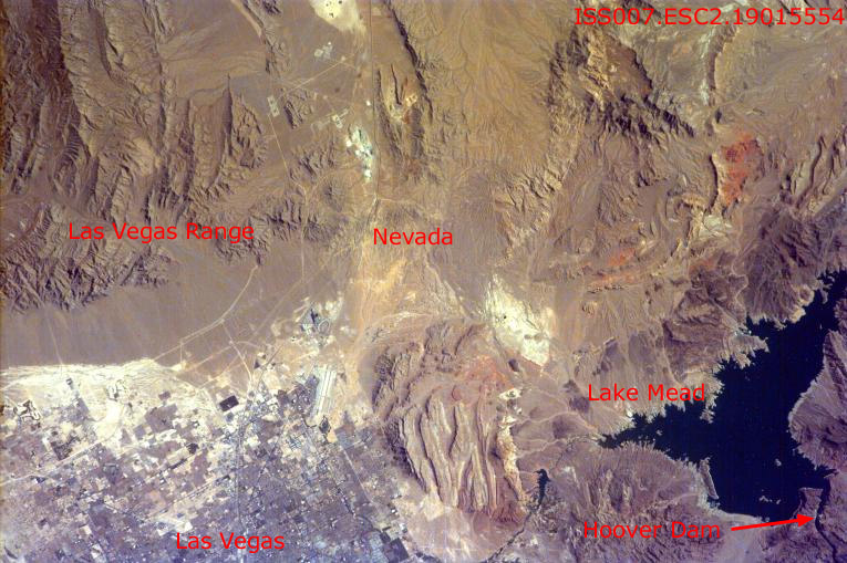 Las Vegas, Nevada.
North is to the upper left. The Las Vegas Wash pours into the leftmost corner of Lake Mead. The Highway 95 to the north-west is clear. The I-15 is probably the curve that streaks from the word Las Vegas up to the right and then more or less to the top middle. UNLV is probably off the picture south of the word Las Vegas.
Credit: NASA: ISS EarthKam.
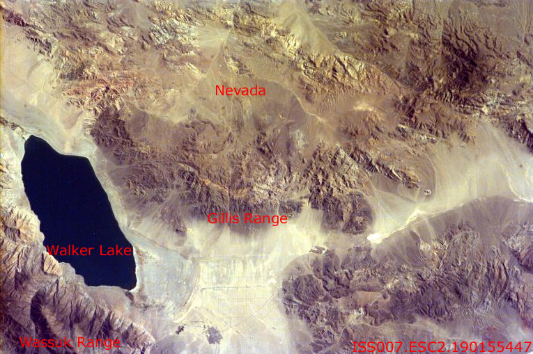 Nevada: Walker Lake region in the south-west.
Credit: NASA: ISS EarthKam.
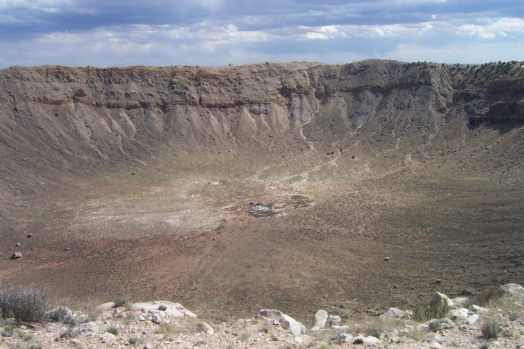
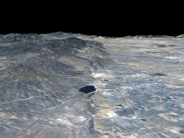
 Meteor Crater in Arizona.
More on Earth craters can be found at the Geological Survey of Canada's Earth Impact Database.
Credit: NASA: Visible Earth.
 A USGS educational picture of Meteor Crater in Arizona.
Credit: U.S. Geological Survey (USGS). Their images are mostly public domain.
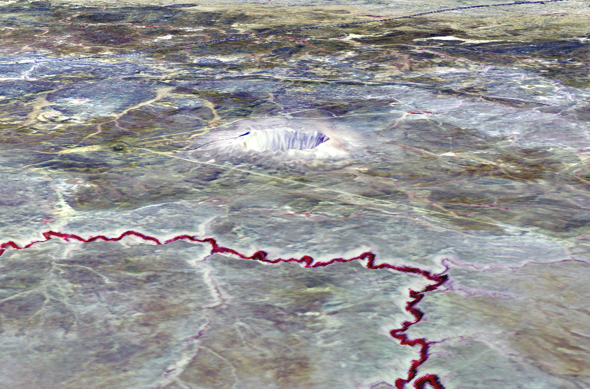
 The Manicouagan impact crater in Quebec, Canada, north of
Baie Comeau.
More information can be found at
JPL.
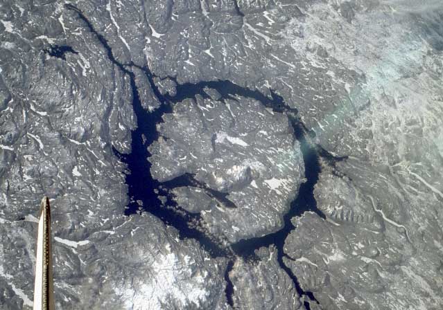
The Manicouagan impact crater in Quebec, Canada, north of
Baie Comeau.
More information can be found at
JPL.
Credit: NASA: ISS EarthKam.
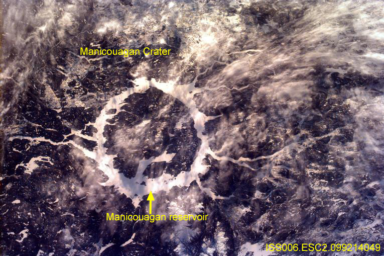
 The Manicouagan impact crater in Quebec, Canada, north of
Baie Comeau.
The Manicouagan impact crater in Quebec, Canada, north of
Baie Comeau.
Credit: NASA: Astronomy Picture of the Day.
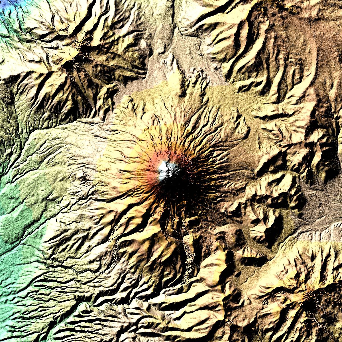
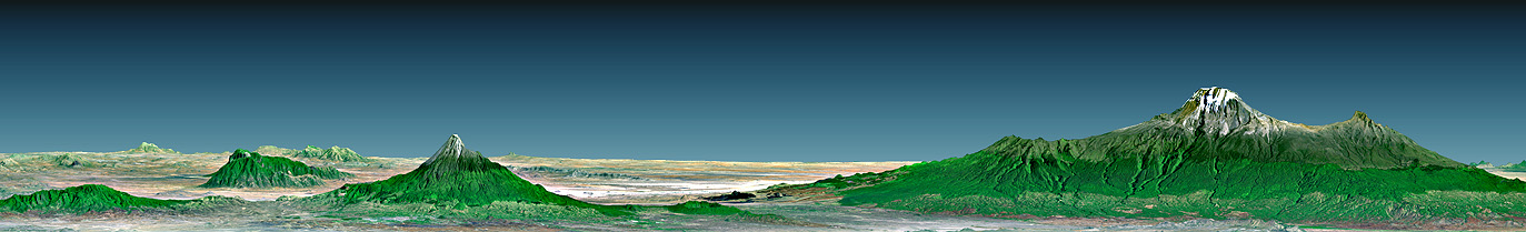 Mt. Kilimanjaro, Tanzania. A volcano.
Credit: NASA: Visible Earth.
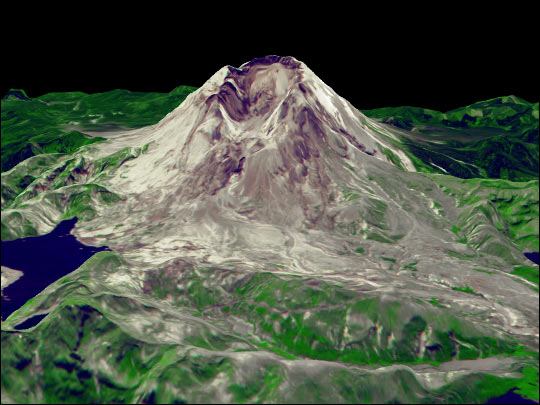 Mt St. Helens. A post-explosion visible/infrared/computer-enhanced
image.
Mt St. Helens. A post-explosion visible/infrared/computer-enhanced
image.
Credit: NASA: Visible Earth.
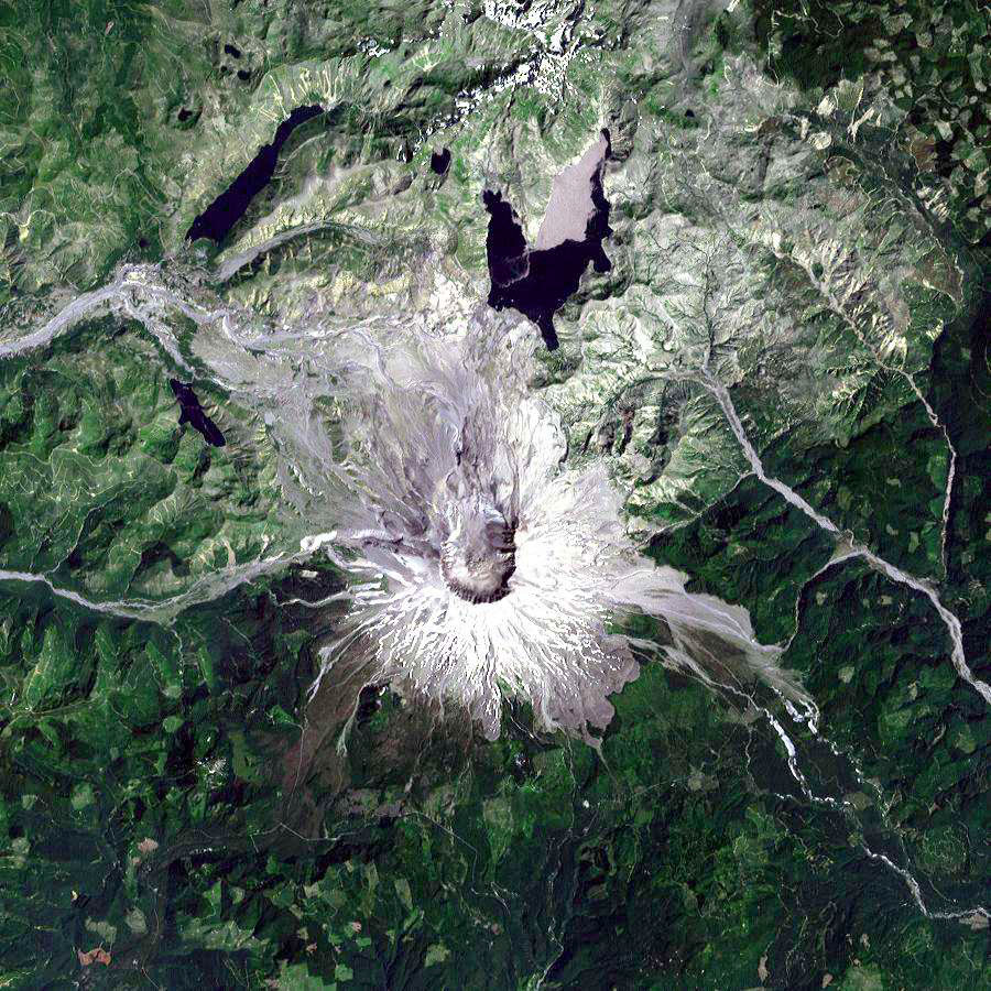 Mt St. Helens. A landsat true-color image.
image.
Mt St. Helens. A landsat true-color image.
image.
Credit: NASA: Visible Earth.
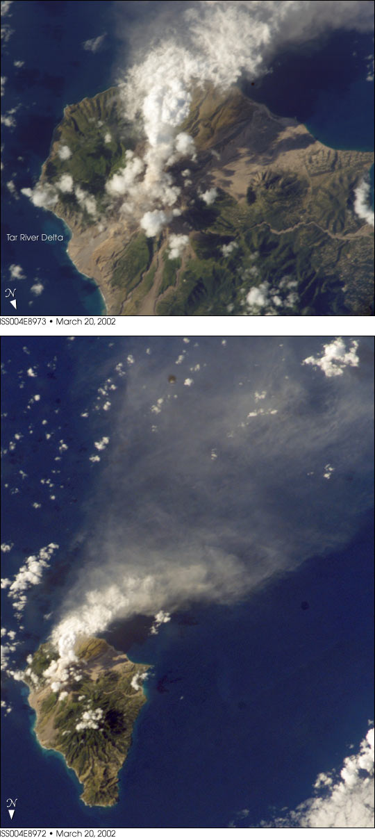 The Soufriere Hills Volcano, Monserrat, 2002mar20.
Credit: NASA: Visible Earth.
 Mt. Cotopaxi in Ecuador. A false color constructed model.
Mt. Cotopaxi is the highest active volcano. It is 5897 meters and is more than 3000 meters higher than the surroundings.
It's base is about 23 km. The outer crater at the top is 800 X 650 meters.
Mt. Cotopaxi is a dangerous active volcano.
Credit: NASA.
 San Andreas Fault: the linear feature straight down the center.
Credit: NASA: Visible Earth.
 Iceland: Mid-Atlantic Ridge, Volcanos, Glaciers.
Credit: NASA: Visible Earth.
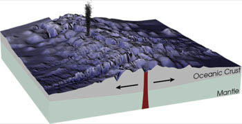 Carton of a mid ocean ridge.
Credit: NASA: Visible Earth.
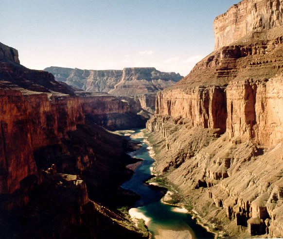 A view of the Grand Canyon presumably.
There was no caption at the USGS Grand Canyon site.
Credit: U.S. Geological Survey (USGS). Their images are mostly public domain.
 Isle of Wight
The Isle of Wight is ancestral home of my line of Jefferys. My grandfather Harry (or Henry) Jeffery may have been born there in 1875, but I don't know. My Dad said the Jefferys worked on the boats which is likely enough---but what boats? Anyway, you can't throw a stone on the Isle of Wight without hitting a Jeffery, and so there's little likelihood of tracking down Old Harry to his lair.
Credit: NASA: NIX. Image ID: NM23-762-210.
 Map of the Earth's geological plates
Credit: Hawaii Natural History Association. Permission is granted for educational reproduction only.
 Map of the Earth's geological plates.
Credit: U.S. Geological Survey (USGS). Their images are mostly public domain.
 Map of Earth's geological plates.
Credit: U.S. Geological Survey (USGS). Their images are mostly public domain.
 Cartoon of plate boundary behavior.
Credit: U.S. Geological Survey (USGS). Their images are mostly public domain.
 Continental drift.
Credit: U.S. Geological Survey (USGS). Their images are mostly public domain.
 Convection in the asthenosphere driving plate tectonics.
The convection cells extend throughout the mantle.
Convection occurs whenever you have fluid (in some sense) and a strong enough temperature gradient.
It happens in the Earth's atmosphere, in the Earth's interior, in stars, and in a boiling pot of water.
Credit: U.S. Geological Survey (USGS). Their images are mostly public domain.
 Iceland straddling tectonic plate.
Credit: U.S. Geological Survey (USGS). Their images are mostly public domain.
 Krafla Volcano erupting.
Krafla Volcano is on the Mid-Atlantic Ridge as it crosses Iceland.
Credit: Gudmundur E. Sigvaldason, Nordic Volcanological Institute, Reykjavik, Iceland . I assume that Dr. Sigvaldason will allow educational use of his image without express permission. It is displayed at this USGS site.
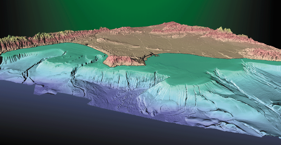
 San Andreas Fault.
The San Andreas Fault is one of the relatively few places where a plate boundary crosses land. Lower California is will one day become an island.
For more information on the San Andreas Fault see USGS The San Andreas Fault site
Credit: U.S. Geological Survey (USGS). Their images are mostly public domain.
 San Andreas Fault.
This is an aerial view of the San Andreas fault splitting Carrizo Plain in the Temblor Range east of San Luis Obispo, California.
The San Andreas Fault is one of the relatively few places where a plate boundary crosses land. Lower California is will one day become an island.
For more information on the San Andreas Fault see USGS The San Andreas Fault site
Credit: U.S. Geological Survey (USGS): photographer Robert E. Wallace, USGS. USGS images are mostly public domain.
 The Mississippi Delta.
The Mississippi Delta is formed from alluvial deposits of soil from the Mississippi River. The Army Corps of Engineers and others spend much of the 20th century trying to straighten the channels in the Delta for flood control among other things. The result of straighter channels is less deposition and the delta is eroding away. The sediments that used to build up the Delta get deposit out in the deep Gulf of Mexico. By 2100 the New Orleans could submerged. So now people are unstraightening the channels.
Credit: NASA: ISS EarthKam.
 Glacier Bay. Johns Hopkins Glacier calving
Credit: National Oceanic and Atmospheric Administration/Department of Commerce: Image ID: corp1862, NOAA Corps Collection; Location: Alaska Southeast; Photo Date: August 1991; Photographer: Commander John Bortniak, NOAA Corps.
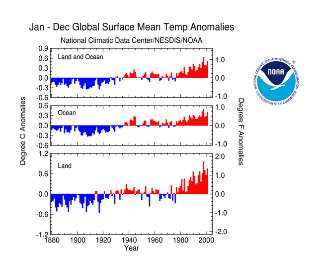 Annual global mean temperature difference from mean temperature
for 1880--2001.
Annual global mean temperature difference from mean temperature
for 1880--2001.
Credit: National Oceanic and Atmospheric Administration/Department of Commerce.
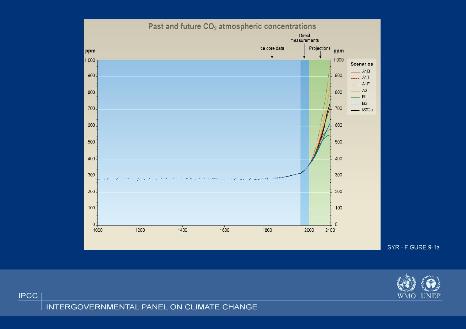 IPCC CO_2 records and predictions.
The historical record back to 1000 AD is from ice core measurements.
Direct measurements have been done since about 1960 when abundance was 315 ppm. The last direct measurement on this plot was from 2000 when the abundance was about 370 ppm.
Under various circumstances the CO_2 abundance is seen to rise by varying amounts in the next 100 years. The IPCC states that much of the variation is due to varying human response.
Actually many people think there is more uncertainty than the IPCC has found.
Currently, the CO_2 abundance is about 379 ppm and since 1960 it has risen by about 17.3 %. (PF-98; Carbon Dioxide Reported at Record Levels; Mauna Loa Observatory of NOAA).
In 2003, the increase was 3 ppm which is a record increase ( Carbon Dioxide Reported at Record Levels). The recent average increase has been about 1.8 ppm
The increase amount does fluctuate, but it is plausible that the 2003, increase was caused by increased fossil fuel burning in Asia, particularly China and India.
Credit: Intergovernmental Panel on Climate Change (IPCC).
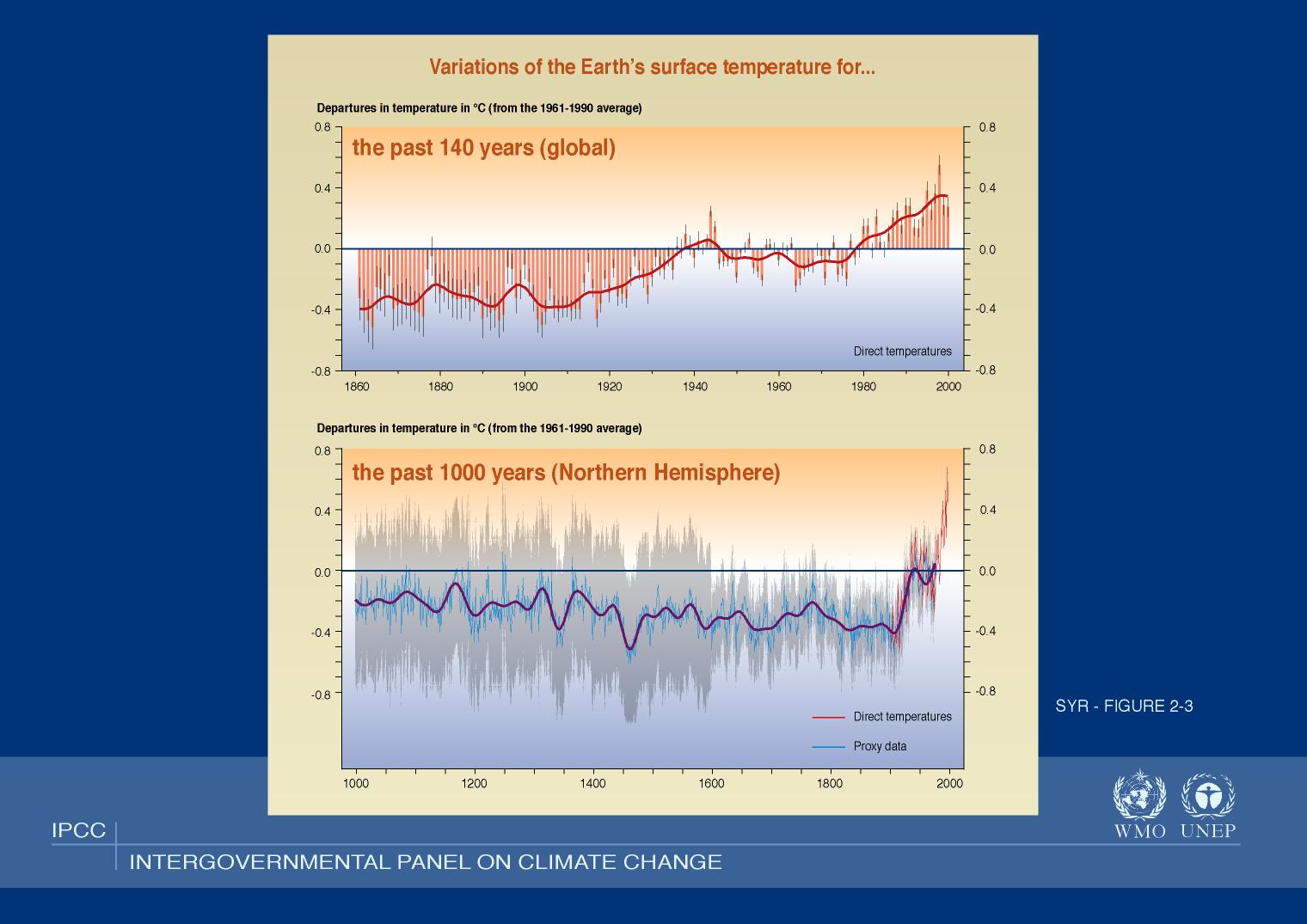 Annual global mean
temperatures relative to the mean 1961--1990 temperature.
Annual global mean
temperatures relative to the mean 1961--1990 temperature.
The grey region on the lower plot indicates the range of uncertainty???. It is considerable, and so it is NOT certain that temperatures were generally cooler over the 2nd millennium.
Since the curve was first published in about 1999, there have been many other calculations with widely different results for the past millennium. They all pretty much agree, however, that the Earth after 1980 has been warmer than any time since 1000 AD (reporter, 2005, Science, February 11, 307, 828).
Credit: Intergovernmental Panel on Climate Change (IPCC).
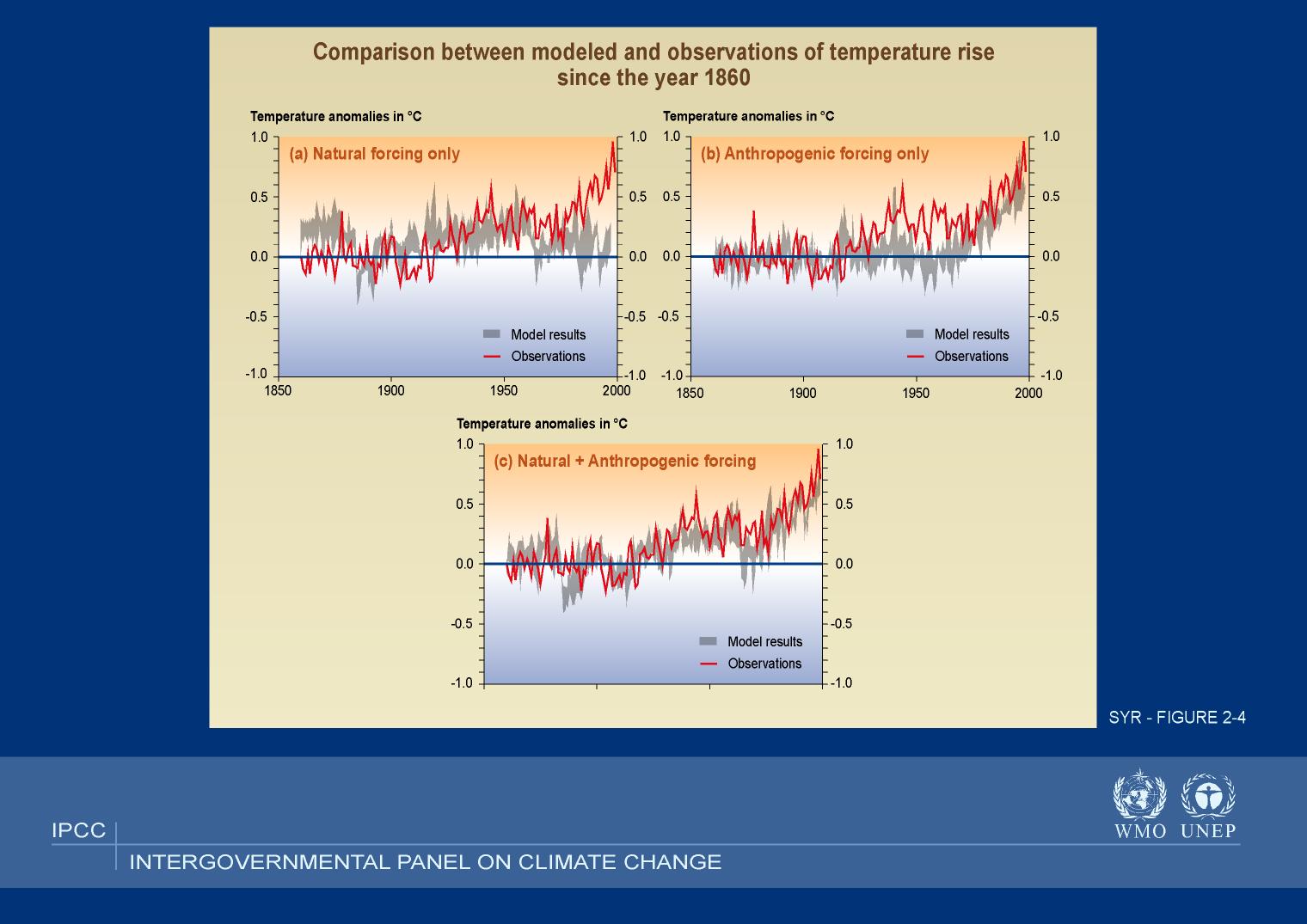 A comparison of models with measured temperature.
The comparison shows models with natural, anthropogenic, and combined forcing for 1860--2000.
The grey region for the model results indicates the range of uncertainty in the model predictions.
An objection in the past to computer model climate predictions was that they could NOT fit the PAST, and so how could you believe them for the FUTURE.
Well now they can fit the PAST.
But how many free parameters have been used?
You can always fit any curve if you adjust the unknown controls (i.e., free parameters). I guess one could find out.
Credit: Intergovernmental Panel on Climate Change (IPCC).
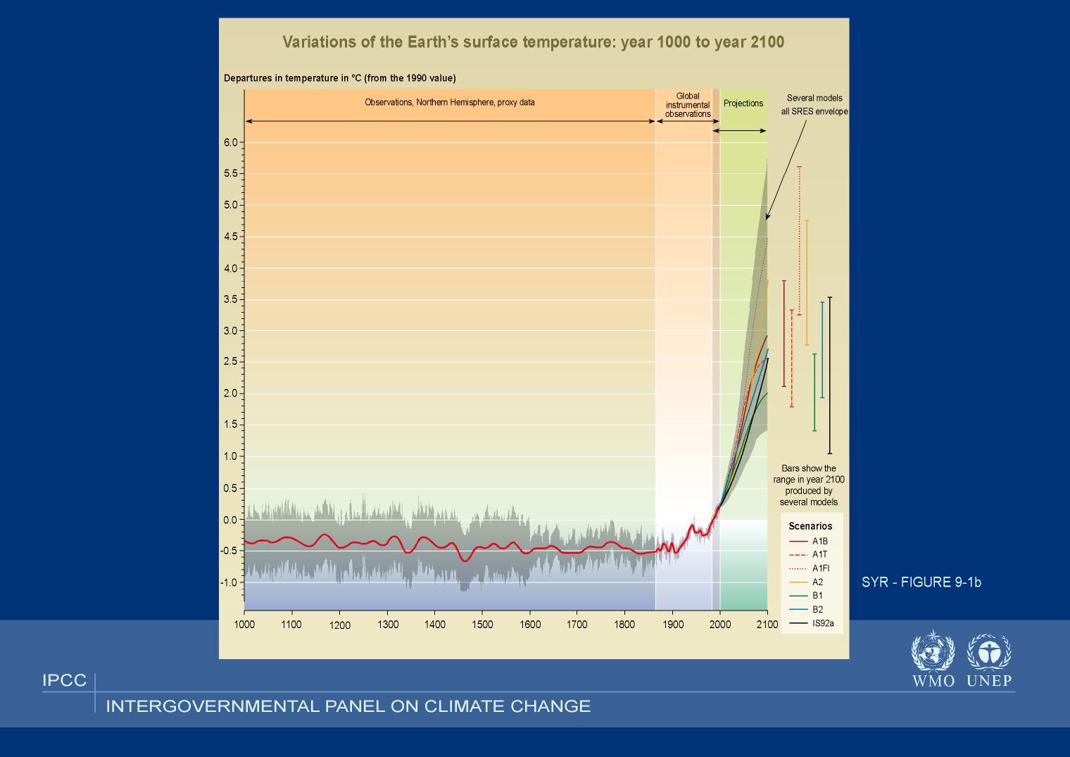 IPCC predictions for temperature increase.
The temperatures are relative to the 1990 global mean temperature.
Under various circumstances the mean global temperature is seen to rise by varying amounts in the next 100 years. The IPCC states that much of the variation is due to varying human response.
Actually many people think there is more uncertainty than the IPCC has found.
Credit: Intergovernmental Panel on Climate Change (IPCC).
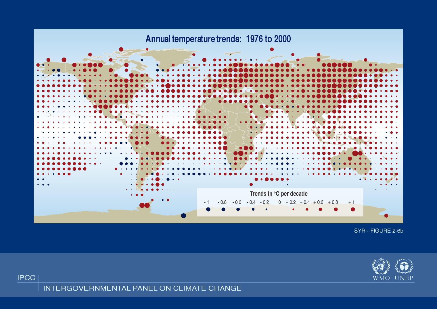 Annual temperature trends all over the Earth for 1976 to 2000.
The dots indicate the increase in annual temperature per decade averaged over the period 1976--2000.
As one can see, temperature change has NOT been uniform, but has been rather complex. Some regions have even gotten colder.
Non-uniform change is probably what we can expect for the future.
Credit: Intergovernmental Panel on Climate Change (IPCC).
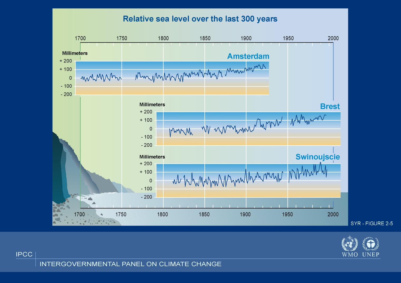 Relative sea levels for 1700--2000.
I guess Amsterdam ceased to be on the open sea circa 1925 due to dikes. Amsterdam is in the Netherlands; Brest is in France on the Atlantic coast of the Brittany Penisula; Swinoujscie (Swinemuende) is in Poland on the Baltic Sea.
Credit: Intergovernmental Panel on Climate Change (IPCC).
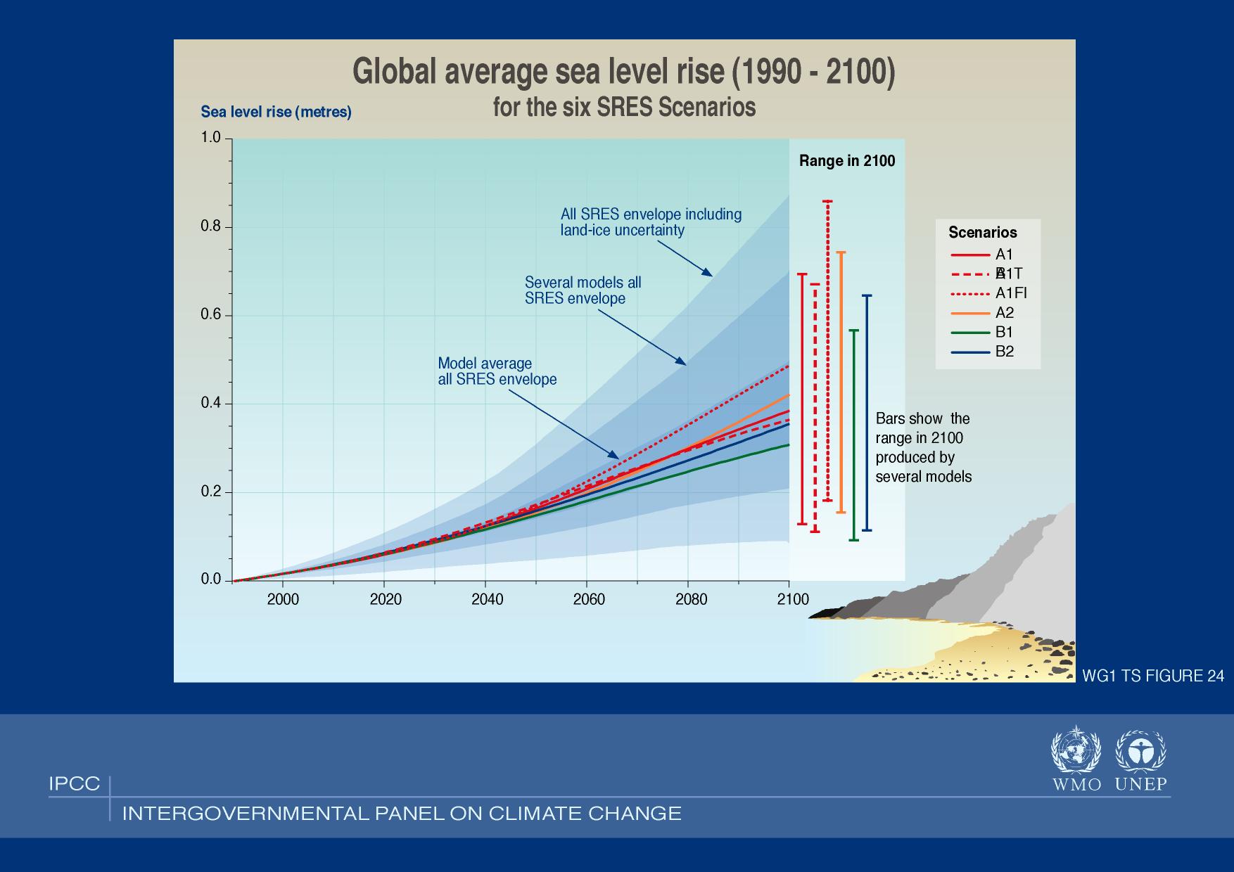 IPCC predictions for the rise in mean sea level.
They present 6 models that depend on varying circumstances many of which are under human control. There also uncertainty envelopes.
Many people believe that the uncertainties are greater than the IPCC estimate.
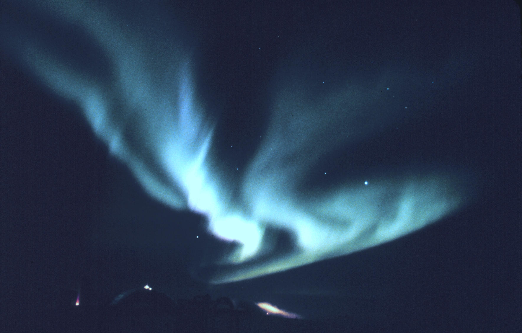
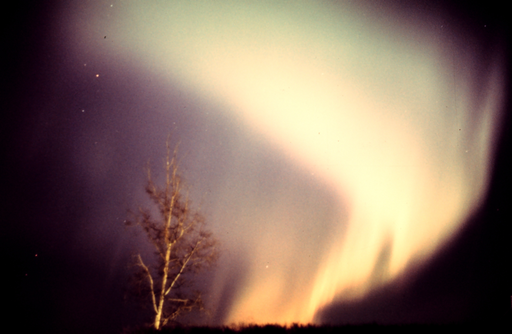
 The Aurora. I think this must be the
Aurora Borealis or Australis.
The Aurora. I think this must be the
Aurora Borealis or Australis.
Credit: ?
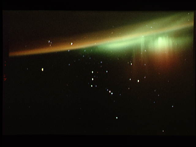
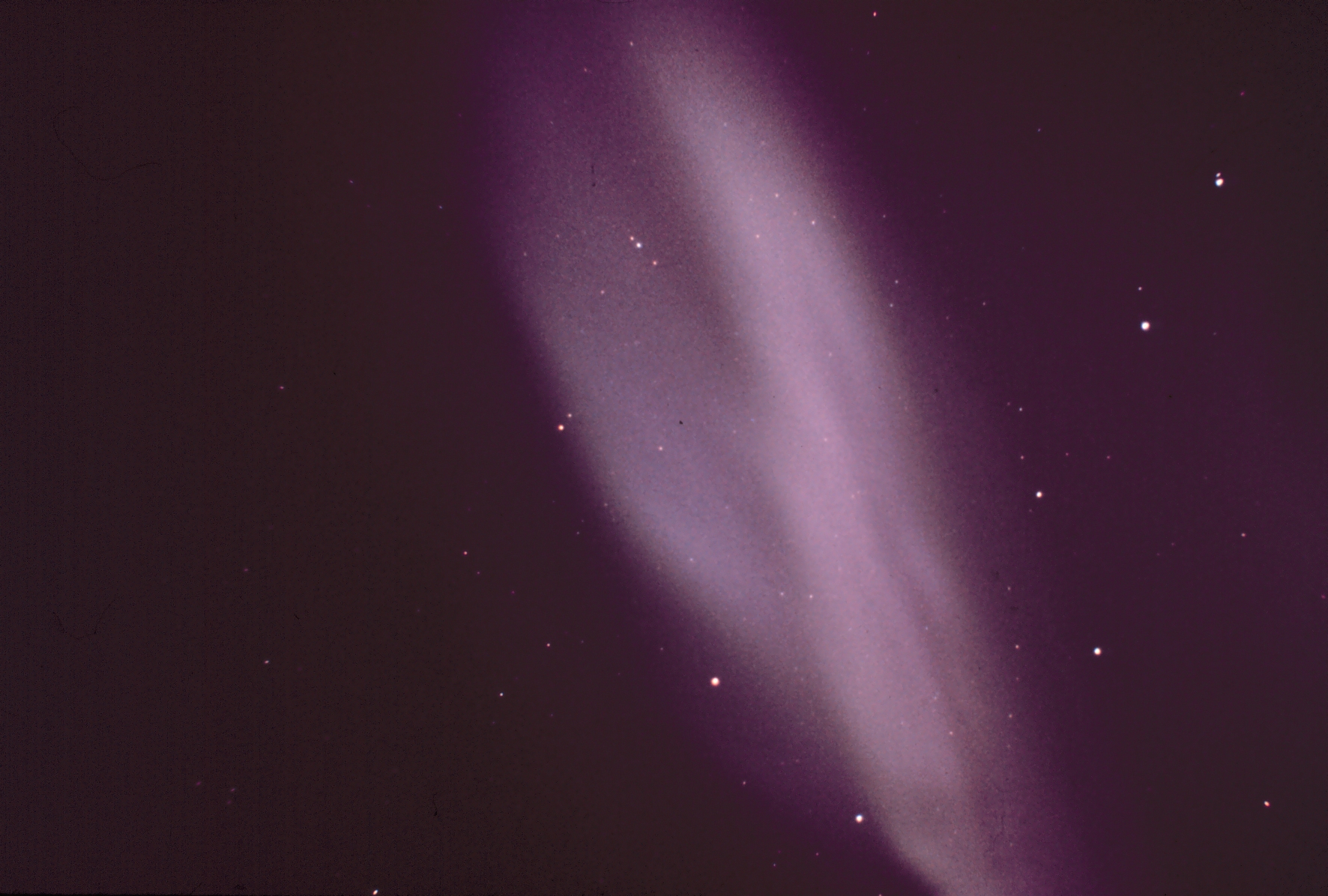
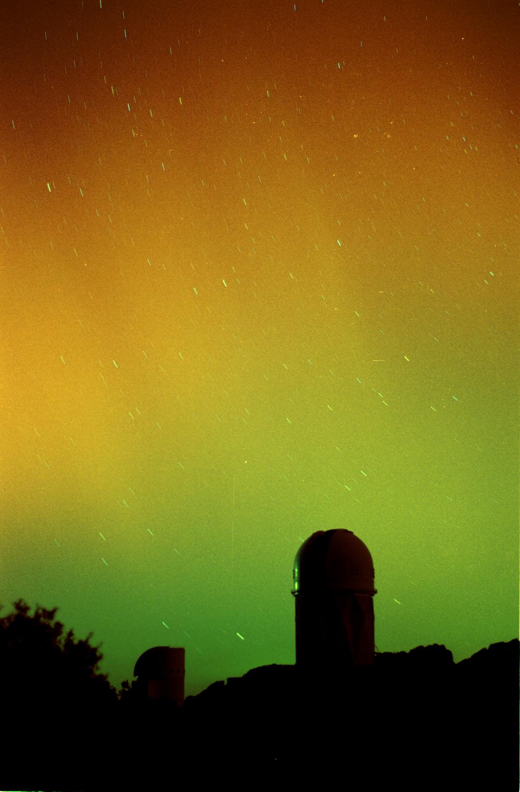 The Aurora at Kitt Peak, Arizona, 2001mar28.
The aurora in Arizona was associated with a coronal mass ejection from the Sun. Coronal mass ejections are massive gusts of the solar wind often accompanying solar flares.
The image is long-exposure as one can see from the finite star images. Long-exposure means that the aurora is brighter than the eye would have seen.
Credit: Adam Block/NOAO/AURA/NSF.
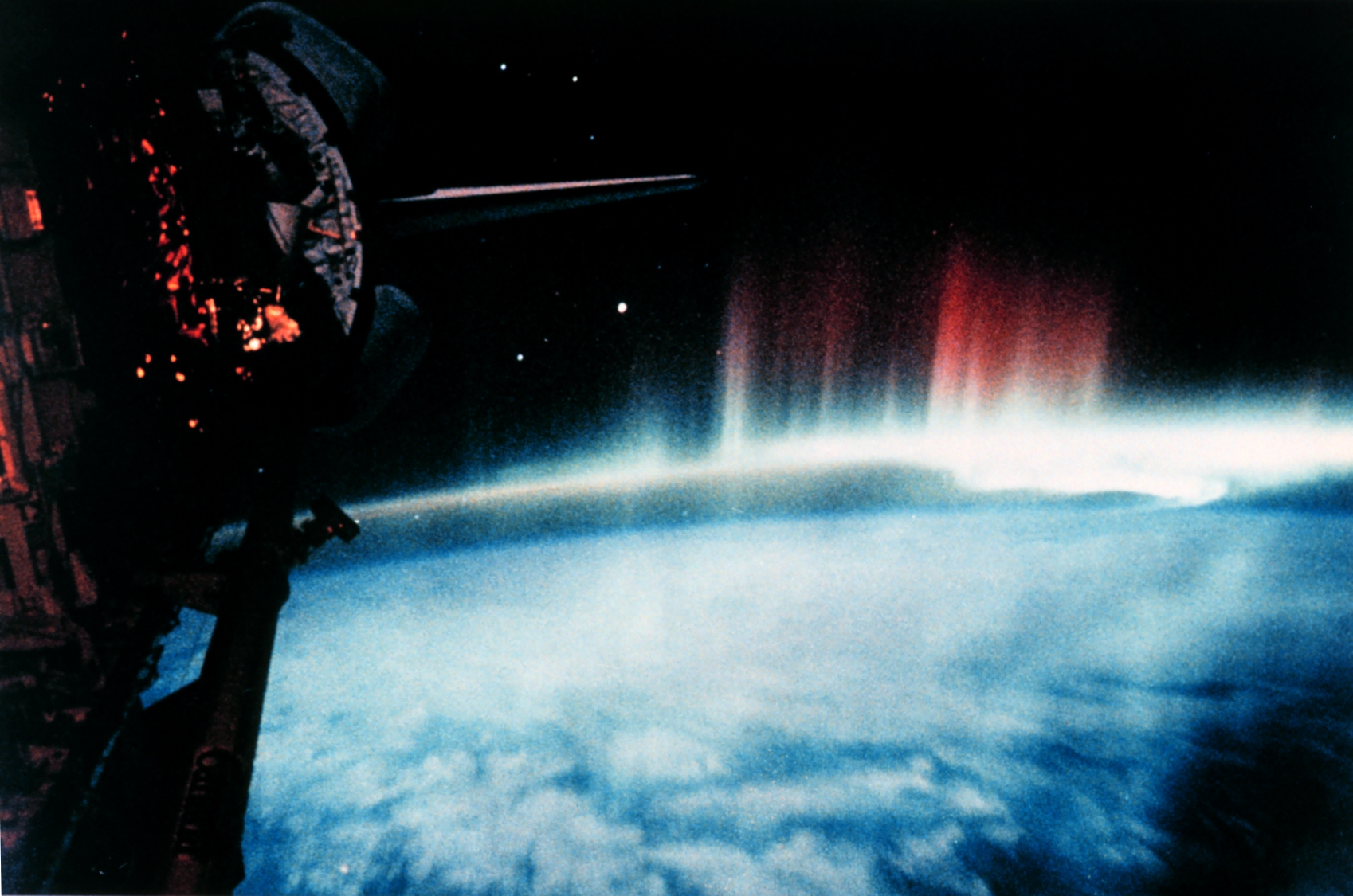
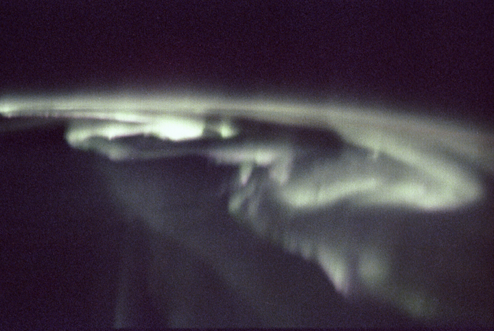 Aurora Borealis from Spacelab, 1992september.
Credit: NASA.
 Aurora Australis from the South Pole Station.
Credit: National Oceanic and Atmospheric Administration/Department of Commerce: Image ID: corp1656, NOAA Corps Collection; Location: Antarctica, South Pole Station; Photo Date: Austral fall and winter 1979; Photographer: Commander John Bortniak, NOAA Corps.
 Aurora Borealis in vicinity of Anchorage.
Credit: National Oceanic and Atmospheric Administration/Department of Commerce: Image ID: wea01022, Historic NWS Collection; Location: Anchorage, Alaska; Photo Date: 1977; Photographer: Doctor Yohsuke Kamide, Nagoya University; Credit: Collection of Dr. Herbert Kroehl, NGDC.
 Auroral spectrum lines as compared to solar spectrum continuum.
Hydrogen, oxygen (O_2), and nitrogen in various forms (N_2, N_2+, N I, N II) provide most of the aurora colors according to this spectrum.
Credit: National Oceanic and Atmospheric Administration/Department of Commerce: Image ID: wea01029, Historic NWS Collection; Credit: Collection of Dr. Herbert Kroehl, NGDC.
 Aurora Australis are seen during strong geomagnetic events.
Credit: National Oceanic and Atmospheric Administration/Department of Commerce: Image ID: wea02000, Historic NWS Collection; Location: Kangaroo Island, South Australia; Photographer: David Miller; Credit: National Geophysical Data Center.
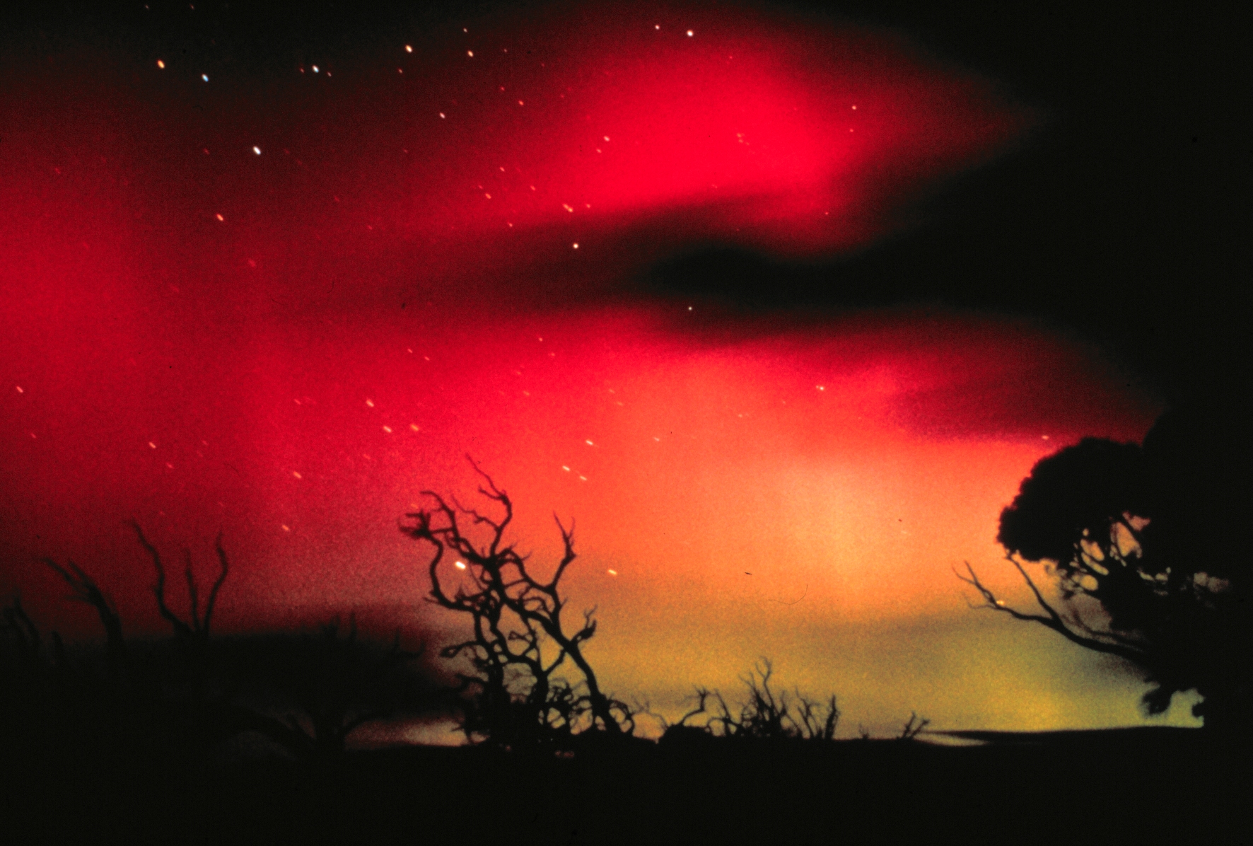
 The Aurora Australis.
The image is long-exposure as one can see from the finite star images. Long-exposure means that the aurora is brighter than the eye would have seen.
Credit: National Oceanic and Atmospheric Administration/Department of Commerce: Image ID: wea02007, Historic NWS Collection; Location: Kangaroo Island, South Australia; Photographer: David Miller; Credit: National Geophysical Data Center.
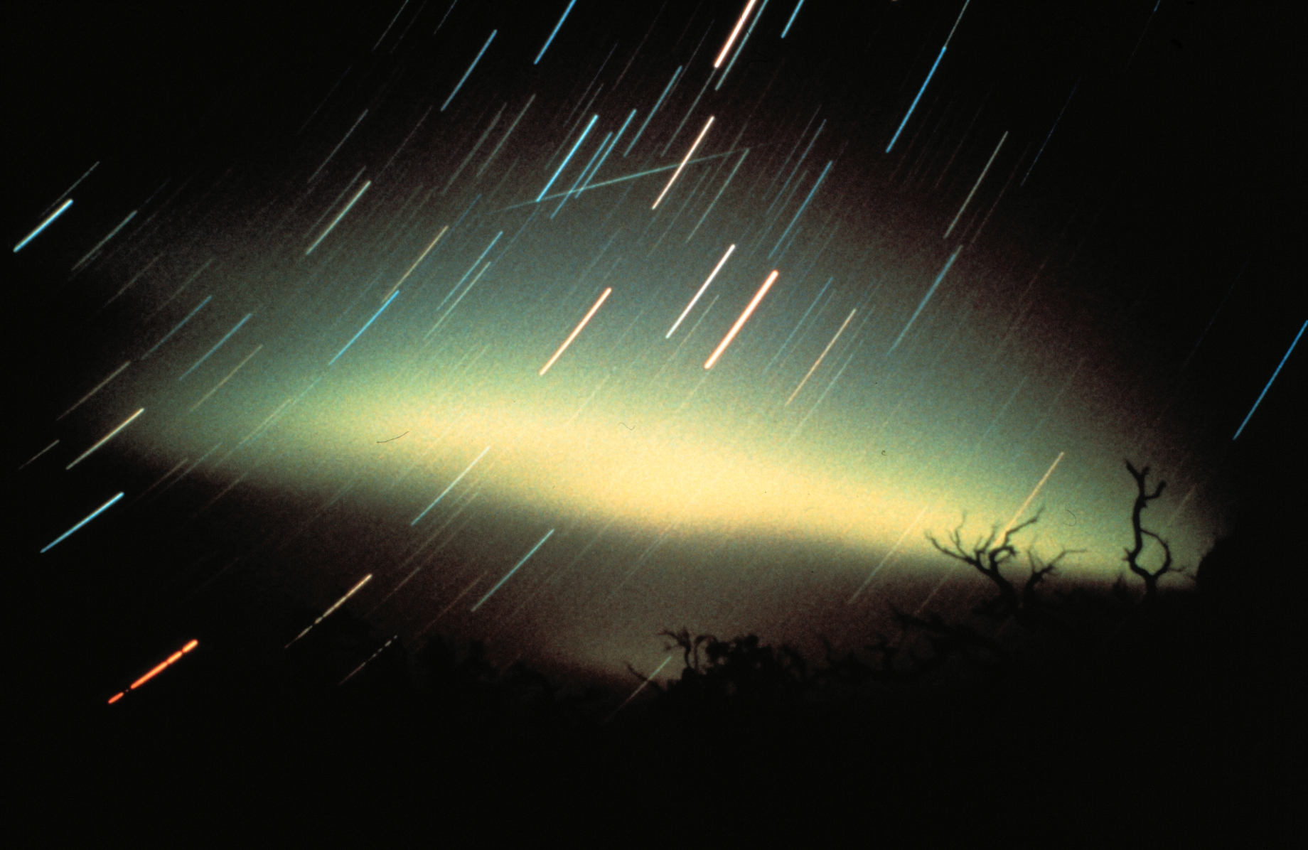
 The other side of the sky: the Aurora from the Shuttle.
Credit: National Oceanic and Atmospheric Administration/Department of Commerce: Image ID: wea01034, Historic NWS Collection.
 Aurora Borealis in vicinity of Anchorage.
Credit: National Oceanic and Atmospheric Administration/Department of Commerce: Image ID: wea01013, Historic NWS Collection; Location: Anchorage, Alaska; Photo Date: 1977; Photographer: Doctor Yohsuke Kamide, Nagoya University; Credit: Collection of Dr. Herbert Kroehl, NGDC.
 NASA
NASA
 A sky image.
Credit: Michael Oates. His sky images are free for public use.
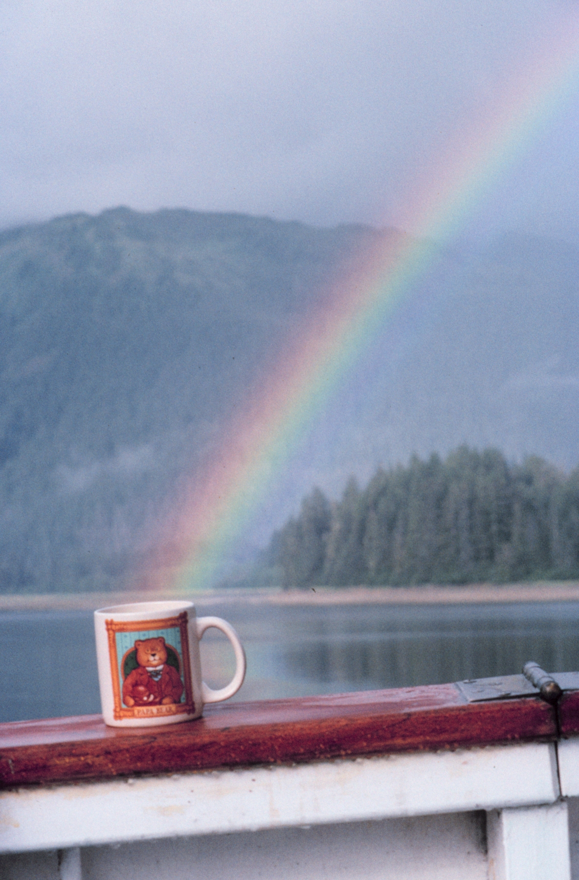 The coffee at the end of the rainbow. It seems to be
sitting on the gunwale (gun plank) of a about.
The coffee at the end of the rainbow. It seems to be
sitting on the gunwale (gun plank) of a about.
Credit: National Oceanic and Atmospheric Administration/Department of Commerce: Image ID: corp2028, NOAA Corps Collection; Photo Date: September 1992; Photographer: Commander John Bortniak, NOAA Corps.
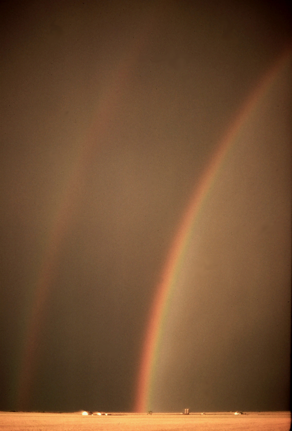 A rainbow over Oklahoma. It's hard to see the secondary rainbow.
Credit: National Oceanic and Atmospheric Administration/Department of Commerce: Image ID: nssl0125, National Severe Storms Laboratory (NSSL) Collection; Location: Oklahoma; Photo Date: May 22, 1976 Extra Credit: NOAA Photo Library, NOAA Central Library; OAR/ERL/National Severe Storms Laboratory (NSSL).
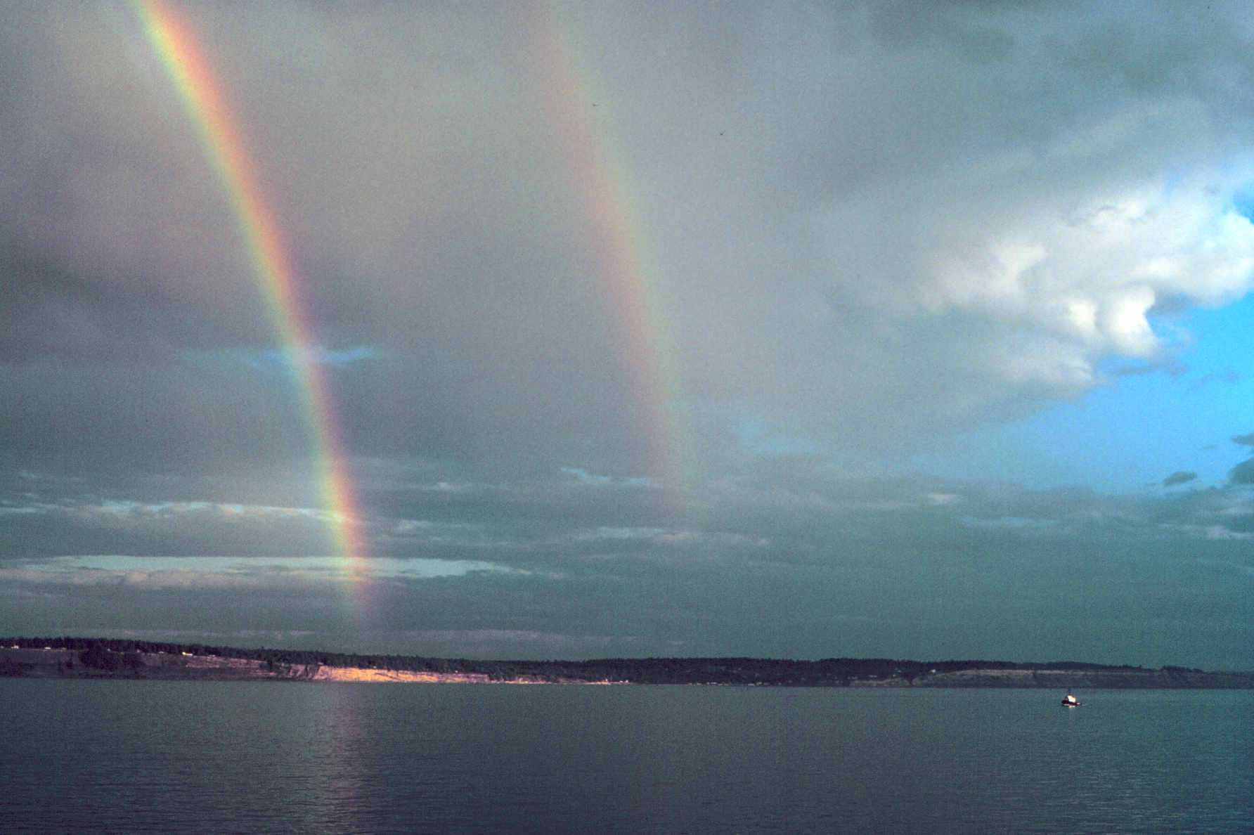 A double rainbow.
Credit: National Oceanic and Atmospheric Administration/Department of Commerce: Image ID: line2112, America's Coastlines Collection; Photographer: Mr. David Sinson, NOAA, Office of Coast Survey
 Tidal zone at low tide.
The parallel ripples form perpendicular to the tide flow.
Credit: National Oceanic and Atmospheric Administration/Department of Commerce: Image ID: line1725, America's Coastlines Collection; Photographer: Mr. David Sinson, NOAA, Office of Coast Survey.
 Wetlands with tidal streams in South Carolina, 1991.
I'd guess this is closer to high tide than to low tide. But I know nothing.
Credit: National Oceanic and Atmospheric Administration/Department of Commerce: Image ID: line0095, America's Coastlines Collection; Photographer: Richard B. Mieremet, Senior Advisor, NOAA OSDIA.
 Lower Patuxent River, Maryland during an extreme high tide.
You can see the tide is running up a country lane of some kind. This is just off Chesapeake Bay where there is considerable land subsidence.
Part of the problem is that if you pump fresh water out of the ground you lower the water table and the Earth subsides. This is a problem NOT unknown in Las Vegas.
Flooding like this could become very common if the sea level rises with global warming.
Credit: National Oceanic and Atmospheric Administration/Department of Commerce: Image ID: line0647, America's Coastlines Collection; Photographer: Mary Hollinger, NODC biologist, NOAA.
 A tidal map of East Friesland from the late 19th/early 20th centuries.
This is Map B in The Riddle of the Sands (1903), a classic nautical spy-thriller by Erskine Childers (1870-1922). Childer was English, but joined the Irish in their rebellion. He was later executed by the Irish government for the illegal possession of a small hand-gun given to him by Michael Collins.
The Riddle of the Sands is one of those great old stories where men were men and women stayed as the romantic interest and didn't try to take over the plot.
Credit: The original publishers of the map were Walker and Cockerell sc.: their copyright is long expired I'd guess. Download site: Wolfram Fassbender's The Riddle of the Sands site.
 The kind of satellite mapping that can be done to study tides.
This is NOT a tidal map. It shows sea height relative to mean sea height with tidal variation averaged away.
The sea height changes are dependent on the temperature of the water, and thus on the heat energy stored in the water.
Water is a rather complicated liquid in that it contracts going from 0 degrees C to about 4 degrees C and then expands as temperature increases above 4 degrees C (HRW-432).
The height measurements are done by radar from the TOPEX/Poseidon satellite. This satellite is in a near polar orbit, and so almost all of the Earth is below it at some time or other.
Credit: NASA: Visible Earth.
 Dissipation of tidal energy.
The tidal friction with the solid Earth and internally via viscosity dissipates energy that ultimately mostly comes from the rotational energy of the Earth.
The dissipation is complex and may have profound current and climate implications.
The removal of Earth rotational energy is increasing the length of the Earth's day by about 0.0014 seconds per century.
The figure illustrates the tidal dissipation in the ocean in milliwatts per square meter. It isn't clear to me what the zero on the scale represents.
Credit: NASA: Visible Earth.
The original of this image is public domain unless the photographer who took lived to be an nonagenarian. But the National Archives don't know the photographer, and so one can perhaps accept it as public domain. However, since the National Archives didn't make a point of the public domain status, I can only believe that they would feel agrieved if I posted it. So I've broken the link.