-
 The solar constant 1978--1999.
The solar constant is the power per unit area (perpendicular to the Earth-Sun line) at the top of the Earth's atmosphere. The mean value is about 1366.5 W/m**2. During a full sunspot solar cycle the value varies by only by 0.1 percent from maximum and minimum. The near constancy of the solar constant is good for life on Earth.
Credit: NASA.
-
 The solar spectrum log-log plot.
Here we have a blackbody fit to the solar spectrum (dashed line), the solar spectrum above the atmosphere (dark blue), and the relative solar spectrum at the Earth's surface in cloud-free conditions (light blue). The wavelength range extends from far UV to far IR.
Because of the small scale, absorption lines in the spectrum have been mostly smoothed out. A larger scale would show many them.
Note, the Sun spectrum peaks in the visible.
Note also, the Earth's atmosphere is opaque in the UV and in many broad bands in the IR, but the visible is pretty transparent.
The transparent bands are sometimes called WINDOWS in astro jargon.
Credit: US Naval Research Laboratory, Judith Lean; download site NASA.
A good site for the solar spectrum is NOAA's The Solar Spectrum and Terrestrial Effects site.
-
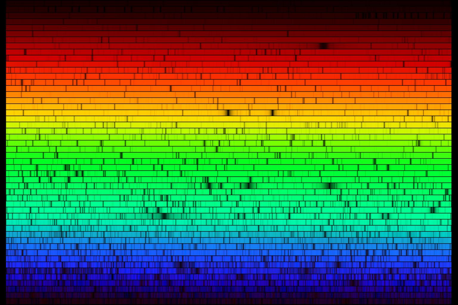 The solar spectrum from the Earth's surface as the eye sees it strongly
dispersed.
The solar spectrum from the Earth's surface as the eye sees it strongly
dispersed.
The spectrum is spread out on a wrap-around line.
The spectrum is basically a Planck spectrum of temperature 5800 K (Se-147) with absorption lines from the Sun and Earth's atmosphere superimposed.
Credit: N.A.Sharp, NOAO/NSO/Kitt Peak FTS/AURA/NSF.
-
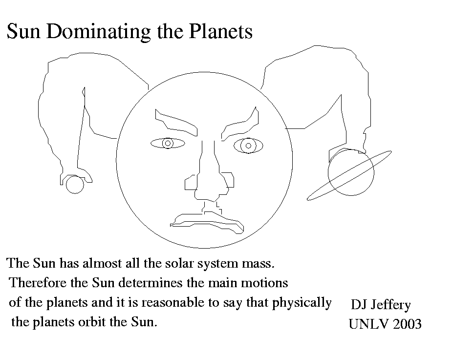
 The Sun dominating the planets.
-
 The Sun and Moon have nearly the same angular diameter on the sky.
-
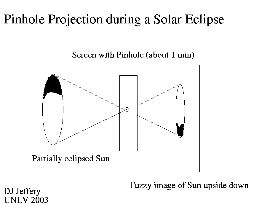
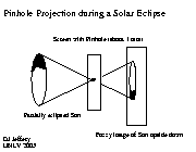 The Sun can be viewed safely by pinhole projection.
Pinhole projection is especially interesting for viewing solar eclipses.
 Total Solar Eclipse Paths 2001--2025.
Note, the Mercator projection: thus the path width is latitude dependent. Thus Arctic and Antarctic paths look very large even though they are not really any larger than tropical paths.
The diameter of the umbra on the Earth (i.e., the totality region) is 269 km at most and the umbra remains over any one point on the Earth for 7.5 minutes at most.
The minimum umbra speed is about 1700 km/hr (Se-43).
The eclipse sweeps basically eastward: both umbra and earth are moving east, but umbra is faster.
Mainly because of the tilt of the Earth's axis from the Ecliptic Pole the eclipse paths are curved as the image show: i.e., curved with respect to straight lines of a latitude on a Mercator map.
Credit: courtesy of Fred Espenak, NASA/Goddard Space Flight Center, Eclipse Home Page.
 A total solar eclipse sequence from 1999 in France.
Credit: Luc Viatour . Downloaded from Wikipedia under a free licence for general use with appropriate credit.
 Annular and Hybrid Solar Eclipse Paths 2001--2025.
Note, the Mercator projection: thus the path width is latitude dependent. Thus Arctic and Antarctic paths look very large even though they are not really any larger than tropical paths.
Recall the umbra does not reach the ground during an annular eclipse. The path shown must be that of annularity defined somehow.
The minimum umbra speed is about 1700 km/hr (Se-43).
The eclipse sweeps basically eastward: both umbra and earth are moving east, but umbra is faster.
Mainly because of the tilt of the Earth's axis from the Ecliptic Pole the eclipse paths are curved as the image show: i.e., curved with respect to straight lines of a latitude on a Mercator map.
Credit: courtesy of Fred Espenak, NASA/Goddard Space Flight Center, Eclipse Home Page.

-
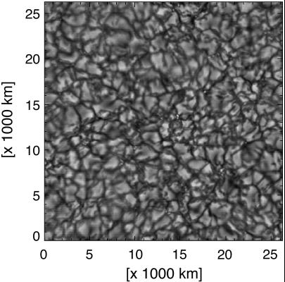 A black and white picture of the granulation on the Sun.
The granules are the hot rising blobs of the convection zone. The photosphere is the upper layer of the zone. The granules break up in about 10 minutes and have a size scale of about 1000 km (Cox-364; Se-148).
Credit: T. Rimmele/NSO/AURA/NSF.
-
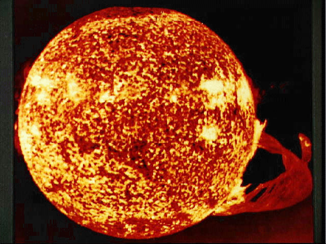 The Sun with a giant prominence.
One of the most spectacular prominences ever seen. From Skylab, 1973dec19. The image is in the UV and hence is false color.
Credit: NASA. I've lost track of the download site, but the image appears in Se-161.
-
 Sunspots and granulation.
Between the granules the gas sinks.
Sunspots are somewhat colder (about 4000 K) than the surroundings (about 6000 K) and so appear dark. The are regions where magnetic field lines plunge into or rise out of the sun: thus they often come in pairs.
One can see the granulation off the spots. The granules are the tops of hot convective currents. They break up in about 10 minutes and have a size scale of about 1000 km (Cox-364; Se-148).
Credit: ?
-
 This the way the Sun always looks in the X-rays band.
The Sun certainly looks a lot more active in X-ray than in the visible, but remember it is actually very dim there. Most light is visible and comes from the comparatively quiet, spherical photosphere.
Credit: ?
-
 The Sun in white light with sunspots including a rare spiral one.
This image must have been taken in kind of a neutral filter. So I think it approximates what you would see if you just toned down the sunlight to a tolerable level without re-mixing the colors. The background is fake.
Note, the Sun is darker toward the edges where you are not seeing so directly into the hotter brighter layers.
Credit: NSO/AURA/NSF.
-
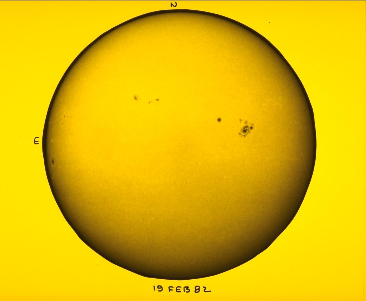
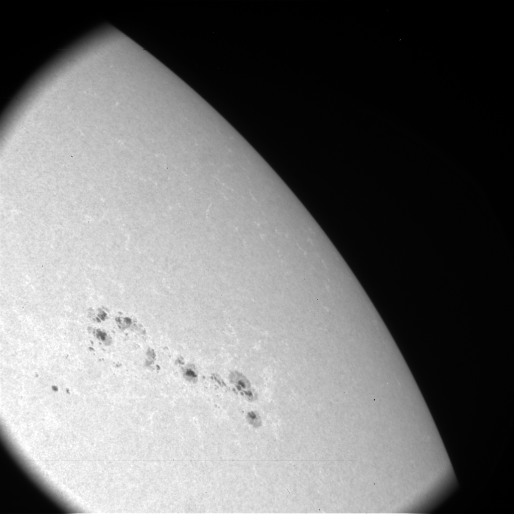 A white light (i.e., visible) image of the Sun with sunspots.
Credit: NASA.
-
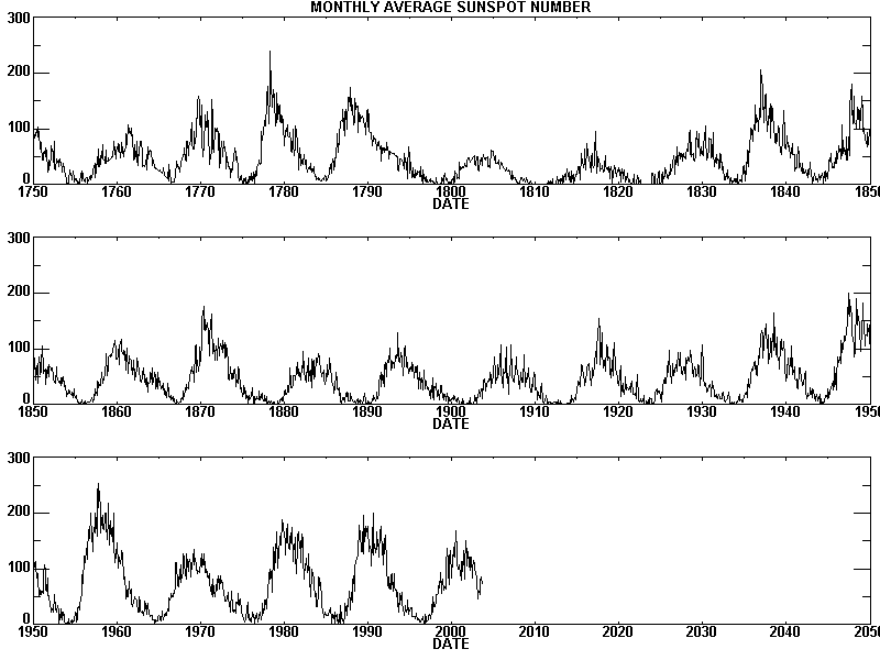 Monthly average number of sunspots since 1750.
Credit: NASA.
-
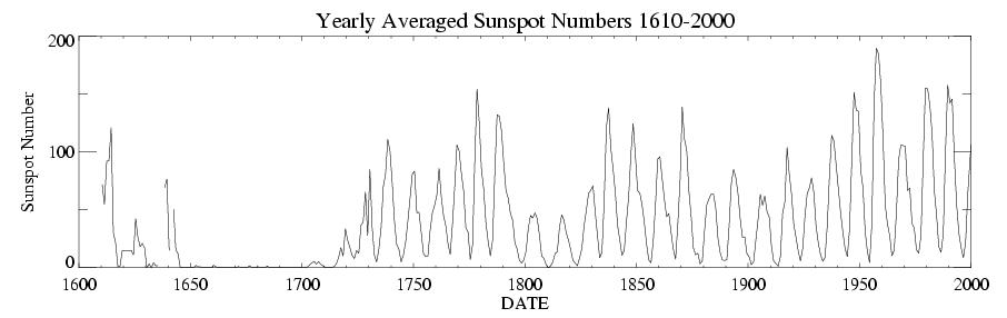 Yearly average number of sunspots since 1610.
Note, the Maunder minimum. This is the period 1645--1715 where there were few sunspots. This time seems to have corresponded to a world-wide cold spell (sometimes called the Little Ice Age) (Ze-293). There may be a connection.
-
[The Little Ice Age is an ill-defined term. Some people
use it for the whole period 1315--1860 and mean a period
of constant climate shifts and not necessarily a cold spell
(Fa-248--249).]
Credit: NASA.
-
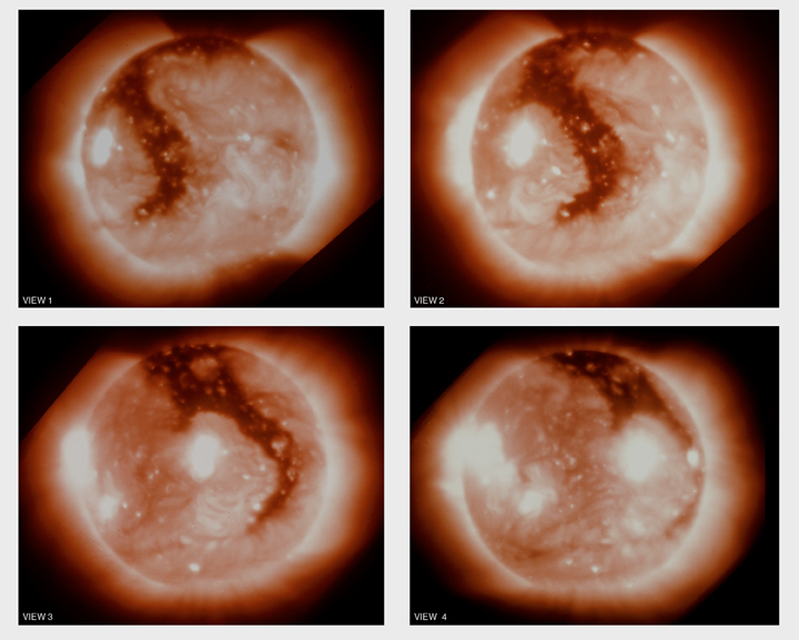
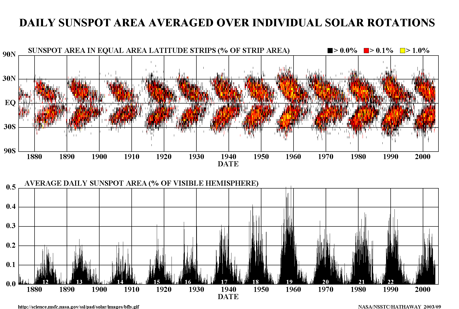 A sunspot butterfly diagram.
This diagram shows the abundance of sunpots at different solar latitudes as a function of time.
The shape of the pattern gives rise to the name butterfly diagram.
Credit: NASA.
-
 A He II 0.0304 micron emission line image.
A Sun image in He II 0.0304 micron emission line. The shown color is, of course, false.
We are seeing the upper chromosphere/lower transition region, not the photosphere. There is a nice PROMINENCE.
The arc shape is because the 60,000 K plasma follows magnetic field lines.
Credit: NASA: SOHO. SOHO is the Solar and Heliospheric Observatory.
-
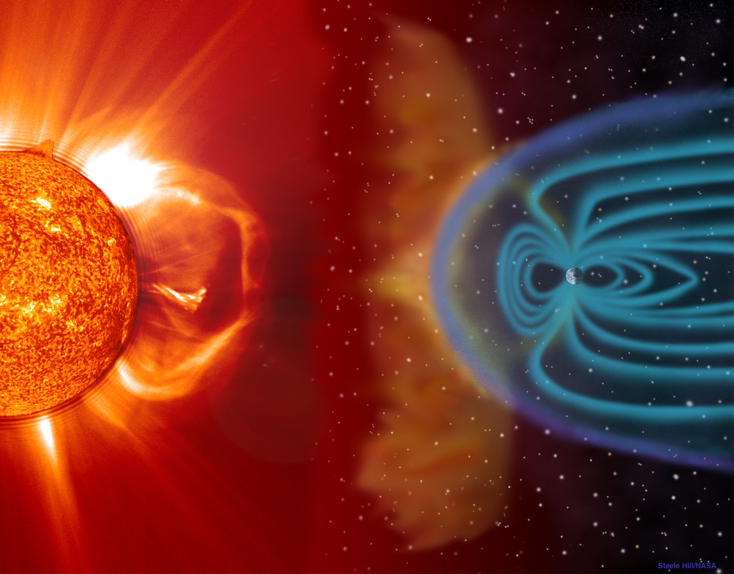
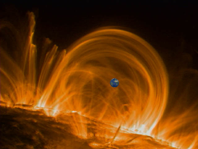 Coronal loops or the Earth in Hell.
A false color, ultraviolet image of coronal loops with the Earth superimposed and to scale.
Coronal loops resemble prominences: they are arcs consisting of gas spiraling around magnetic field lines.
But coronal loops are much hotter: prominences are of order tens of thousands of degrees; coronal loops are of order milions of degrees.
Because of their high temperature they are most visible in the ultraviolet.
Coronal loops rise up and crash down at high speeds (of order 100 km/s) and last ????.
The corona itself can be thought of as largely consisting of coronal loops.
Most of the heating of the loops seems to occur near the base where they emerge from the photosphere.
The heating is somehow affected by magnetic effects.
Credit: NASA/GSFC, TRACE spacecraft; download site Views of the Solar System: Calvin J. Hamilton.
-
 A UV series of images of the Sun with an eruptive prominence.
An eruptive prominence is not the same as a coronal mass ejection: it is probably much less powerful. The blob can still make it to Earth. This is an extreme ultraviolet image from the SOHO probe and so the color is false.
Credit: NASA.
-
 An eruptive prominence seen in the UV?
Credit: ?
-
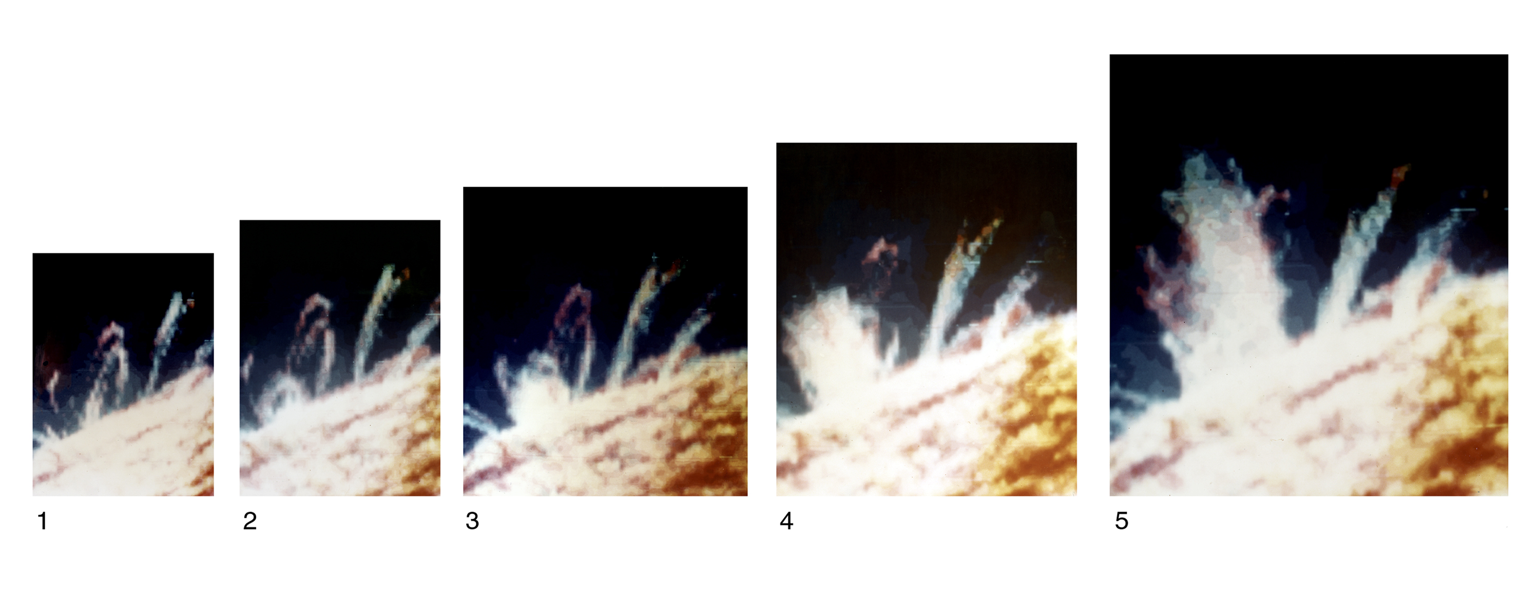 A UV series of images of the Sun with an eruption of some kind.
The images are about 5 minutes apart. Chromospheric material is breaking through magnetic field bonds. I guess is just has a surge of kinetic energy and breaks free.
Credit: NASA.
-
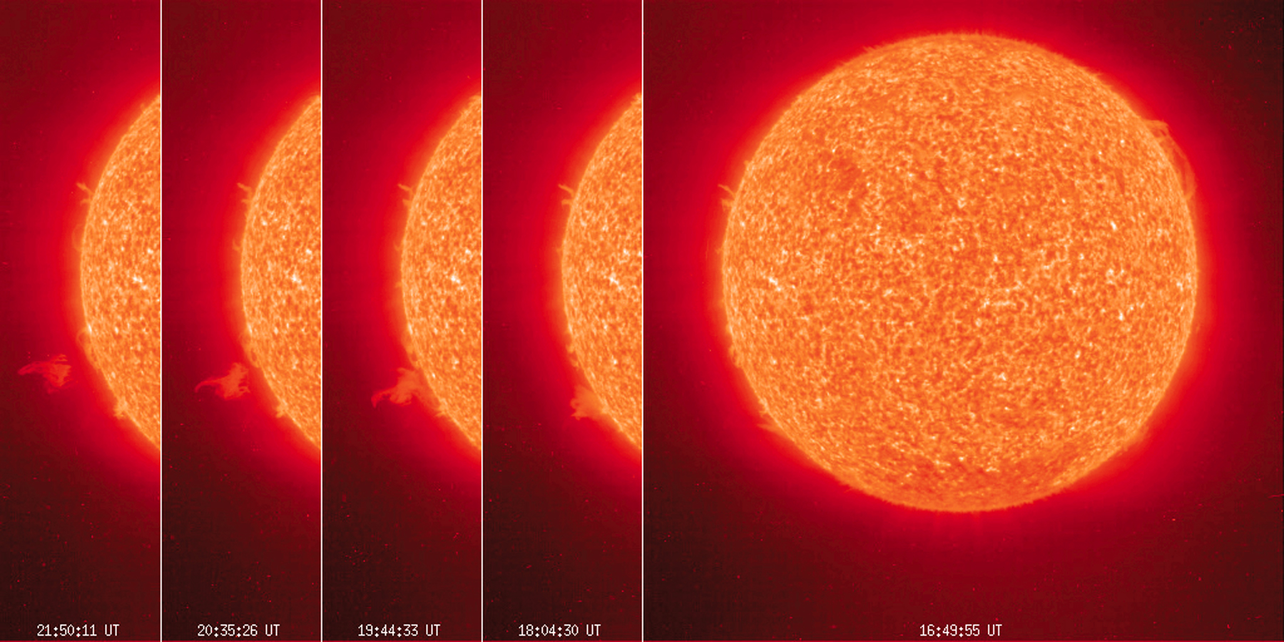
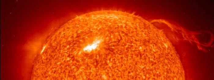
 The largest solar flare on record.
From 2001apr02, the largest solar flare on record. The image is masked about the Sun and probably composite. The solar flare have energies of up to of order a billion megatons. These explosions are when magnetic energy is suddenly released as kinetic energy. They apparently can lead to coronal mass ejections which is what I think we are seeing here on the right.
The color is false. Probably this is a UV image.
Credit: NASA: SOHO.
-
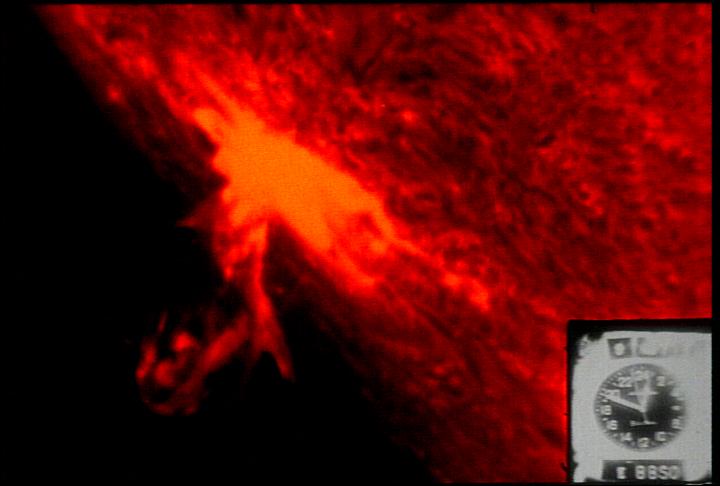 The a solar flare seen on the limb of the Sun, 1971oct10.
The flare is being observed in the H alpha line (i.e., the red line emission of hydrogen).
Credit: NASA.
-
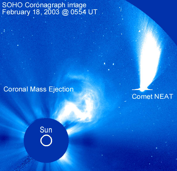
 SOHO picture of a coronal mass ejection with Comet Neat.
This is a 2003feb18 image. The caption gives no information on wavelength, but I'd guess the visible band since we see stars and the corona looks white. The Sun is masked.
Credit: NASA: SOHO mission.
-
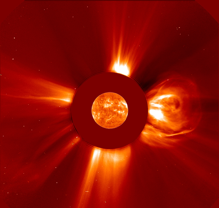
 A composite/artificial image of the a coronal mass ejection.
The image is not to scale.
Coronal mass ejections are the biggest kind of solar wind effect on the Earth. They can cause severe magnetic storms on Earth.
Credit: NASA. See also the medium size version .
-
 X-ray images of a boot-shaped coronal hole from Skylab 1973.
The images are from about 2 days apart. The rotation of the Sun is clear. Coronal holes seem to be magnetic field free areas or areas of outwardly open magnetic field lines in the corona that allow more free-streaming solar wind sort of like the nozzle of the hose whipped around.
Credit: NASA.
-
 SOHO picture of the Sun's corona with the photosphere masked.
This 2000may03 picture also shows some planets and the Pleiades. I've no idea what wavelength band is used. Probably optical.
The ``disks'' on the planets are an artifact of over-exposure. The dark band is the arm holding the mask.
The planet positions for the image are shown here:

Credit: NASA: SOHO mission.
-
 Skylab X-ray image of the Sun's corona.
The information doesn't explain the false color. What wavelength? X-ray?
Credit: NASA
-
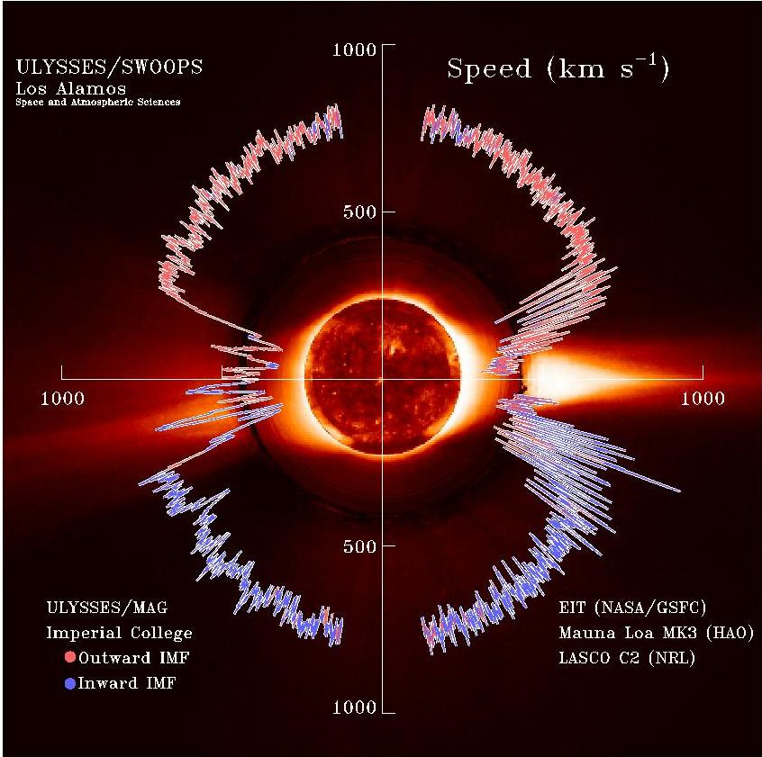 The Ulysses probe's map of solar wind speed.
The diagram is not well captioned. I'm guessing that the image is in the X-ray or UV (and hence false color). IMF probably stands for something magnetic field. I assume that all these speeds were measured at the circular orbit of Ulysses, but I can't track that information right now.
Credit: NASA
-
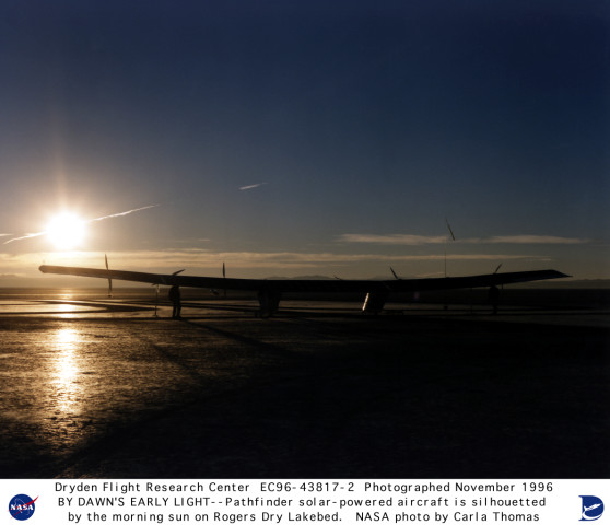 The uncrewed, solar-powered Pathfinder aircraft lands at dawn.
Credit: NASA.
-
 Solar eclipse with corona.
The corona is a hot (of order 1,000,000 K), very lower density layer of gas surrounding the Sun.
It is milky white and appears wispy because the ionized atoms stream along magnetic field lines.
Image deleted.
-
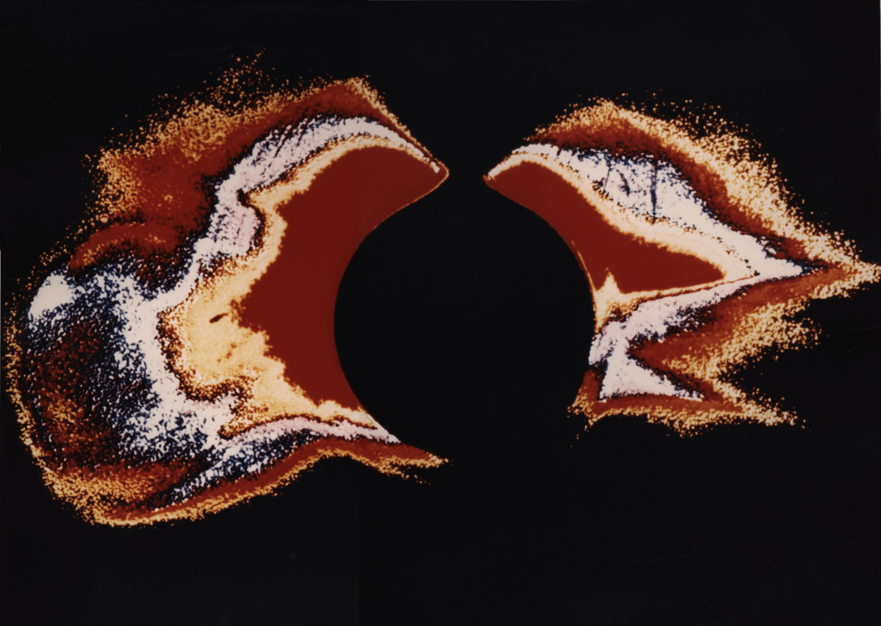
 Solar eclipse with prominences.
Note, the Sun's diameter is just about 100 times that of the Earth.
Consequently, the prominences are huge---they can be bigger than the Earth.
Credit: ?
-
 Total solar eclipse as seen from the Gemini 12 spacecraft, 1966nov12
Credit: NASA.
-
 Solar eclipse shadow over the Indian Ocean on 2002dec04.
Credit: NASA.
-
 NASA. The credit has the date wrong: the Apollo 12 mission was from
1969nov14 to 1969nov24.
NASA. The credit has the date wrong: the Apollo 12 mission was from
1969nov14 to 1969nov24.
-
 A total eclipse with prominences.
The prominences are red because of H alpha emission (i.e., emission from the red line of hydrogen). The prominences are much like the chromosphere. I rather thought the chromosphere itself could be seen in a total eclipse, but maybe only the prominences can be. Credit: NASA.
- Total Eclipse 1995oct24
a,
b,
c,
d
Lousy little thumbnails of a eclipse with diamond ring effect and
corona.
Credit:
NASA, but they hardly deserve it.
-
 Total solar eclipse tracks 2001--2025.
Credit: courtesy of Fred Espenak, NASA/Goddard Space Flight Center, Eclipse Home Page .
-
Annular solar eclipse tracks 2001--2025.
Credit: courtesy of Fred Espenak, NASA/Goddard Space Flight Center, Eclipse Home Page .
-
 Bill Livingston/NSO/AURA/NSF .
-
 The diamond ring effect.
The diamond ring effect occurs when a bit of the Sun just peeps through a lunar valley or the like at the edge of the lunar disk.
Credit: Bill Livingston/NSO/AURA/NSF.
-
 Three quarters partial solar eclipse.
There seems to be a spot in the upper part near the Moon's limb.
Credit: Bill Livingston, NSO/AURA/NSF.
-
 Total solar eclipse with corona visible, but no prominences.
Credit: NSO/AURA/NSF.