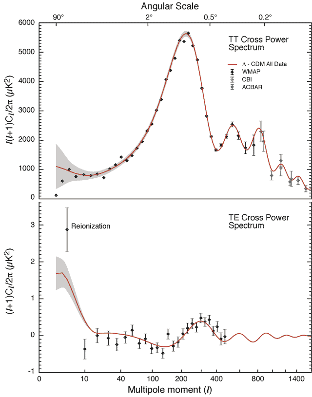
 Caption:
Cosmic microwave background radiation (CMB)
power spectrum from WMAP (2003).
Caption:
Cosmic microwave background radiation (CMB)
power spectrum from WMAP (2003).
These plots are rather difficult to interpret simply.
But rather vaguely, the top plot shows of frequency of hot and cold spots of various angular sizes on the sky (FK-652--653). Large spots are on the left; small spots on the right.
The data points come from the WMAP satellite and other detectors.
The curve is fit to the data???---but with how many free parameters---of what is called a scale-invariant power spectrum which is a prediction of most inflation models irregardless of the details of the inflation mechanism (CL-263,265,274--275; Gr-309).
The fact that inflation predicted the observations is an astonishing triumph of the inflation idea.
It does NOT prove inflation, but it certainly strongly supports it.
Credit/Permission: NASA/WMAP Science Team / Public domain. Download site: NASA/WMAP Science Team: Images: Other Images, but this particular image no longer seems be posted. Image link: Itself.